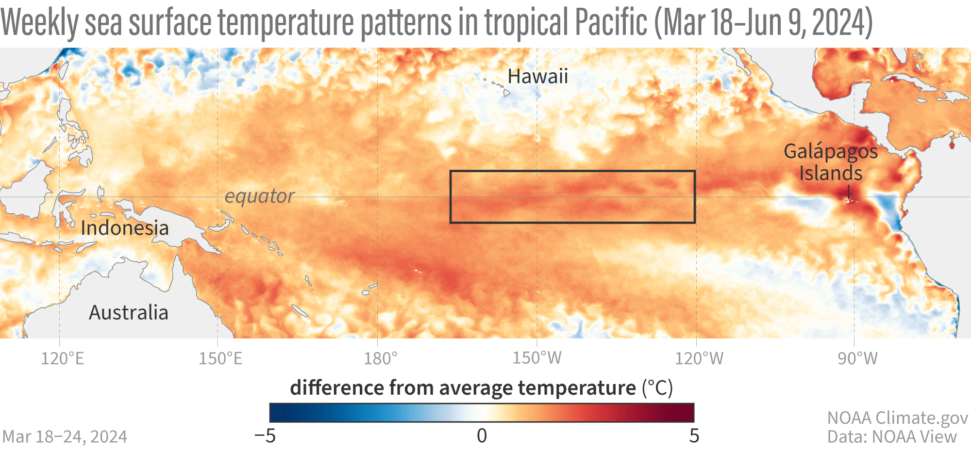
Image caption
This animation shows weekly sea surface temperatures in the Pacific Ocean compared to average from March 18-June 9, 2024. Orange and red areas were warmer than average; blue areas were cooler than average. Warmer-than-average sea surface temperatures in the key ENSO-monitoring region of the tropical Pacific (outlined with black box) have started to be replaced by cooler-than-average waters—a sign that La Niña may be brewing. NOAA Climate.gov animation, based on Coral Reef Watch Data and maps from NOAA View. View the full-size version in its own browser window.