Image caption
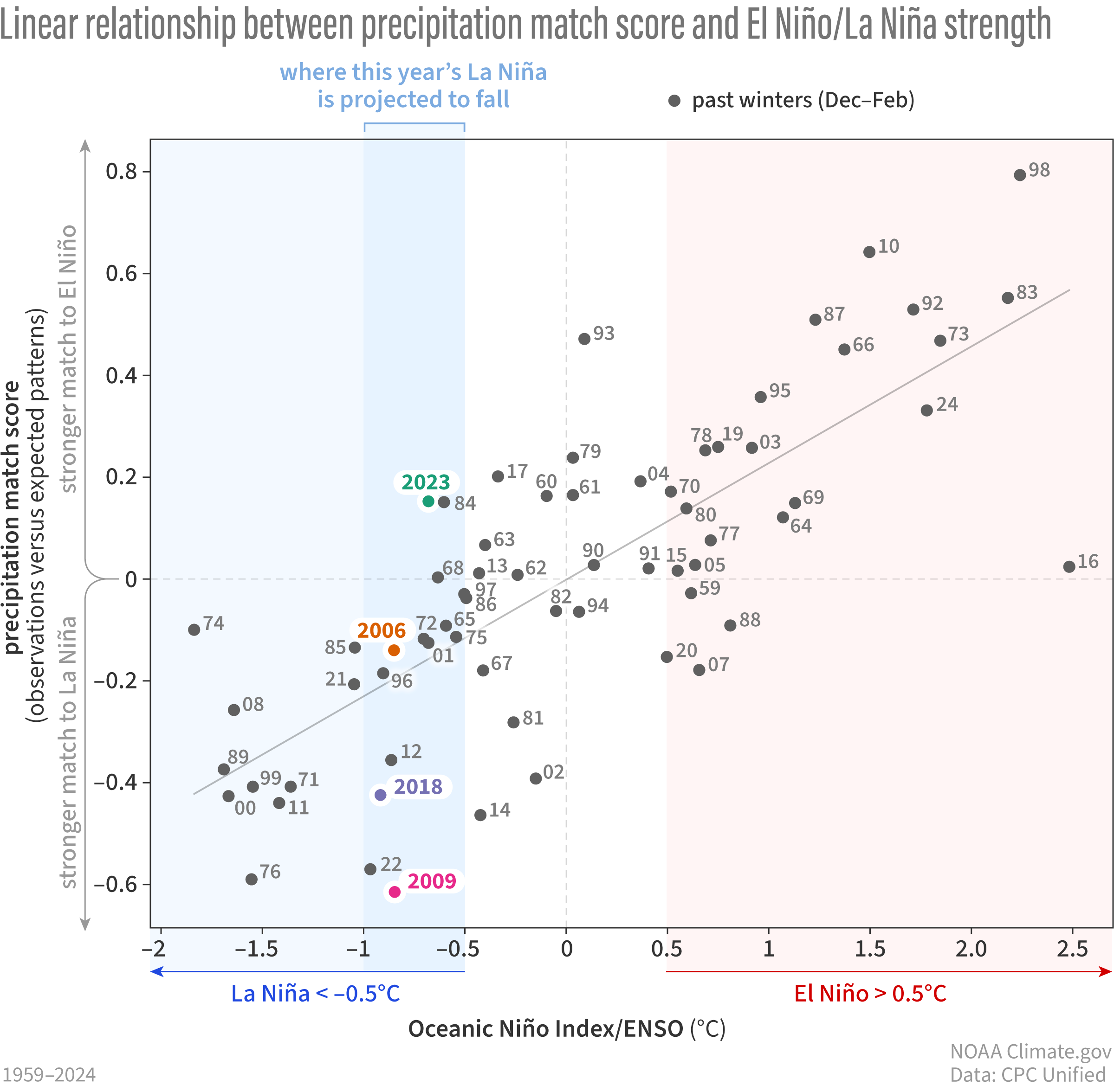
The relationship between the ENSO index (ONI) on the horizontal axis and the Match Score on the vertical axis. Organized this way, the graph is like a map that can be split into 4 territories, or quadrants. Each past winter (December-February) gets a dot “mapped” into one of the quadrants based on the strength of la Niña or El Niño (left or right) and how well it matched the expected impacts. A larger positive match score means that winter’s precipitation anomaly map better resembled what was expected based on past El Niño events. A larger, more negative match score means that winter’s precipitation anomaly map better resembled what was expected based on past La Niña. The “best fit” line is the thin diagonal line running from the bottom left to the top left and is the line that best fits all the points (located where it minimizes the difference between all the actual scores from the best fit prediction). Map by climate.gov based on analysis by M. L’Heureux (reference).