Understanding NOAA’s monthly and seasonal climate outlooks
On the third Thursday of every month, NOAA’s Climate Prediction Center issues an outlook for temperature and precipitation for the United States for the coming month. These climate outlooks are updated on the last day of each month. Those updated outlooks are the basis for the posts that appear on Climate.gov each month. Seasonal (90-day) outlooks are released around the middle of each month.
Outlooks show probability, not actual temperature or precipitation
NOAA’s monthly and seasonal climate outlooks do not predict the actual temperature or precipitation amounts for upcoming months or seasons. Instead, they predict the probability (percent chance) that upcoming monthly or seasonal average temperature or precipitation will fall in the top third, middle third, or bottom third of the climate record at a given place. Currently, the climate record spans 1991-2020. For simplicity, we refer to those categories as well above normal, near normal, or well below normal. The colors on the outlook maps show which of the three is most likely.
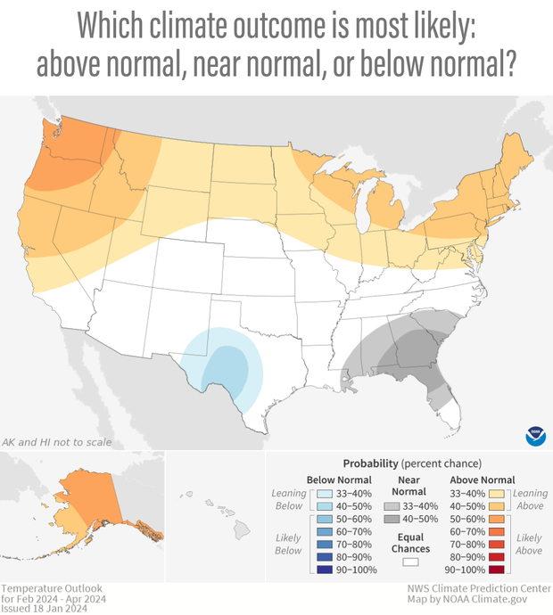
NOAA’s temperature outlook for the 3-month “season” of February–April 2024 showing which temperature outcome was forecast as most likely in different parts of the country—orange and red for well above normal, blues for well below normal, and gray for near normal. The darker the color, the higher the chances of that outcome, not the bigger the departure from normal. White areas mean that any of the three outcomes was equally likely. NOAA Climate.gov image, based on data form the Climate Prediction Center.
The darker the color, the higher the chances of that category, not the bigger the departure from normal. In the map above, the darker orange in the Pacific Northwest or Alaska does not mean temperatures there were predicted to be farther above average than temperatures in the Great Lakes region. The size of the predicted temperature anomaly (anomaly means "difference from average") in each place was the same: in the upper third of the local temperatures recorded for all February–April periods in the 1991–2020 climate record. Instead, the darker colors mean the odds of that happening in Washington, Oregon, or interior Alaska were higher (50-60% chance) than in the Great Lakes Region (40-50% chance).
White areas on the maps mean "equal chances". In those areas, forecasters think that any of the three possible temperature or precipitation outcomes—well above, well below, or near normal—are equally likely. Sometimes an "equal chances" forecast means that there are no strong influences in the climate system that would favor one outcome over another, so forecasters default to the average climatological frequency (33.3 percent chance each). Other times it means that there are competing influences, and forecasters can't say which is more likely to win out.
Math behind the maps
In the real world, the probability for a single category will never be 100 percent. We will never be able to say a month in advance that there is a 100 percent chance of a wetter-than-average May, for instance. The climate is not that predictable. There's always a chance one of the other outcomes sneaks in there. A complete climate outlook, then, is three forecasts rolled into one: the probability of well above normal temperature or precipitation, the probability of well below normal temperature or precipitation, and the probability of near-normal temperature or precipitation.


(click and drag to move slider) (left of slider) An outlook map uses color coding to show the outcome forecasters think is most likely for the upcoming month or season. (right of slider) Even when one outcome is favored, however, the full forecast shows the other outcomes remain possible. The possibility of negative outcomes means those using forecasts that use probability have to carefully balance risk and reward. NOAA Climate.gov images, based on data from the Climate Prediction Center.
Outlook maps show which climate outcome is favored and by how much. To determine the odds of the less likely climate outcomes, forecasters subtract the highest probability from 100 percent and divide the remainder between the other two categories. If the highest probability category is "near normal," then the remaining probability is split evenly between the "well above normal" and "well below normal" categories. If forecasters think there is a 40 percent chance of near-normal temperature in the Pacific Northwest for the coming month, that leaves 60 percent chance (100 minus 40) to be split evenly between the less likely outcomes: 30 percent chance of much cooler than normal and 30 percent chance of much warmer than normal.

Diagram of the probabilities of the less-likely temperature outcomes when the most likely outcome is near-normal temperatures. The chances of near-normal temperatures are subtracted from 100 and the remainder is split evenly between the above- and below-normal outcomes. NOAA Climate.gov, adapted from Climate Prediction Center histogram.
If the highest probability outcome is well above or below normal, the math for splitting up the remaining odds is a little more complicated. Physically speaking, it makes sense that if the odds have tilted toward one climate extreme by a given percent, they’ve tilted away from the opposite extreme outcome by an equal amount. So by convention, forecasters divvy up the remaining probability by holding the chances for near-normal conditions at the climatological average of 33.3 percent, and then subtracting that from the total remainder. What’s left is the probability of the least-favored category.
For example, if the outlook says there is a 40 percent chance of much warmer than normal October in the Southwest, the remaining 60 percent chance would be split unevenly. Near normal would be given the default climatological probability of 33.3 percent, leaving a 26.7 percent chance (60 minus 33.3) of a much cooler than average October. The diagram below shows how each map category breaks down into a full climate forecast.
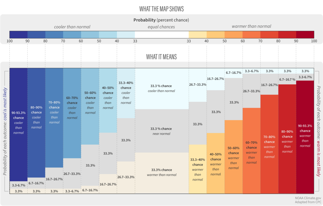
A full monthly temperature outlook is made up of three probabilities: the chances for a warmer-than-average month (yellow to red colors), the chances of a near-average month (gray), and the chances of a cooler-than-average month (blue colors). As the chances of one outcome increase, the chances of the opposite outcome decrease—but never all the way to zero. NOAA Climate.gov graphic, adapted from Climate Prediction Center histogram.
No 0% chance, no 100% chance
If you proceed on this way for higher probabilities of above- or below-normal outcomes, you would eventually reach a point where once you've subtracted from 100 and then given 33.3 percent to the near-normal category, there would be zero or negative percent chance left over for the opposite outcome. Because there is always some degree of uncertainty in any climate forecast, forecasters know it would not be realistic to say there is zero percent chance of a given outcome, any more than they would say there was a 100 percent chance.
So even when the climate seems tipped very strongly toward a given outcome, forecasters never set the probability of the less likely outcomes below 3.3 percent. When one outcome is strongly favored, forecasters set a minimum 3.3 percent chance for the opposite outcome and place the remainder of the balance on a near-normal outcome. For example, if an outlook said the chance of a much warmer than average winter was 80 percent, then the chance of a much colder than average winter would be 3.3 percent, and the chance for a near-normal winter would be 16.7 percent (100 minus 80 minus 3.3).
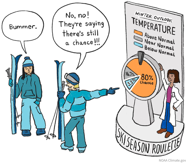
In ski season roulette, a climate outlook will never completely crush a skier's hopes. Even for a hypothetical forecast for an 80% chance of a warmer-than-average winter, forecasters leave at least a small chance—by convention NOAA forecasters say 3.3%—that a cold winter will happen. And of course, a single big snow event can sometimes save an otherwise poor season. NOAA Climate.gov cartoon.
If you’d like a more complete picture of the monthly or seasonal climate outlook, the Climate Prediction Center offers an interactive map that allows users to see the full suite of probabilities for a given location.