Data Snapshots Image Gallery
Precipitation - Global Monthly Percent of Average
- Dataset Details
- Monthly images from 2000 to present
- Download Directories
- Click on any of the links below to view a directory listing of images and assets related to this dataset.
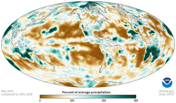
Colors show what percent of its average precipitation a location received in a specific month. White and very light areas had monthly precipitation totals close to the long-term average. Brown areas were drier than average for that month, and blue-green areas were wetter than average for that month.
These maps are based on blended measurements from satellite observations and on-the-ground (“in situ”) measurements. Clouds and precipitation scatter and absorb different wavelengths of energy in consistent ways, creating an energy “signature” that satellites detect. Satellites collect data all around the world, but there is greater uncertainty in their estimates of precipitation amounts. Observations from the ground are more accurate, but there are many places—including the entire global ocean—where there are no ground-based data. This dataset combines the two types of data to provide a globally complete record of precipitation that is accurate and consistent enough to be used for climate research.
Shades of brown show places where total precipitation was less than 100 percent of the 1979-2020 average for the month. Shades of blue-green show places where precipitation was more than 100 percent of that month’s average. The darker the color, the larger the difference from the average precipitation. White and very light areas show where precipitation totals were close to average. The color scale is not symmetrical because a place can receive no less than zero percent of its average monthly precipitation, but it can receive 200 percent or more than its average monthly precipitation.
Comparing an area’s recent precipitation to its long-term average can tell how wet or how dry the area is compared to usual. Knowing if an area is much drier or much wetter than usual can encourage people to pay close attention to on-the-ground conditions that affect daily life and decisions. People check maps like this to judge crop progress; monitor reservoir levels; consider if lawns and landscaping need water; and to understand the possibilities of flooding. Also, globally complete records of precipitation over long periods of time are necessary for many kinds of climate research.
Data Snapshots are derivatives of existing data products; to meet the needs of a broad audience, we present the source data in a simplified visual style. This set of snapshots is based on the climate data record (CDR) developed by University of Arizona, NASA, and the University of Maryland and made available by the National Centers for Environmental Information (NCEI). To produce our images, we invoke a set of scripts that access the source data and represent them according to our selected color ramps on our base maps.
References
- Source Data Product
- Global Precipitation Climatology Project (GPCP) Monthly Precipitation Climate Data Record
- Access to Source Data
- NCEI direct HTTPS download
- Reviewer
- Guojun Gu
