Data Snapshots Image Gallery
SST - ENSO Region, Monthly Difference from Average
- Dataset Details
- Monthly images from 2013 to present
- Download Directories
- Click on any of the links below to view a directory listing of images and assets related to this dataset.
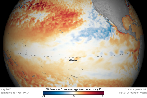
Colors on this map show where and by how much monthly sea surface temperature differed from long-term average (1985-1993, details from Coral Reef Watch). Red areas were warmer than average, and blue areas were cooler than average. The darker the color, the larger the difference from the long-term average. White and very light areas were near average. [Editor's note: All maps are based on the 1985-1993 climatology. Due to a processing glitch, maps prior to September 2021 are incorrectly labelled as using a base period of 1981-2010. If correcting this date is important for your use, you can rebuild the image with the assets in the full-resolution zip file.]
Warmer-than-average sea surface temperature across the central and eastern tropical Pacific is one of the indicators of El Niño conditions. El Niño is the name for the warm phase of a major climate pattern called the El Niño Southern Oscillation (ENSO). Conversely, cooler-than-average sea surface temperature across this region is one indicator of La Niña conditions. La Niña is the name for the cool phase of ENSO.
These monthly measurements are made from NOAA's CoralTemp sea surface temperature (SST) data. Every day, instruments on eight satellites in two different orbits (geostationary and polar) measure sea surface temperature by checking how much energy is radiated by the ocean at different wavelengths. Computer programs plot these measurements on a gridded map and then merge and smooth the data into a gap-free product using mathematical filters. Each grid point covers an area approximately 5 x 5 km. Daily temperatures at each grid point are averaged together to calculate monthly average temperature.
To calculate the difference-from-average temperatures shown here, a computer program takes the monthly average temperature at each grid point, and subtracts the long-term average for that month. If the result is a positive number, the sea surface was warmer than the long-term average. A negative result from the subtraction means the sea surface was cooler than usual.
Shades of blue show locations where sea surface temperature was cooler than its long-term average. Locations shown in shades of orange and red are where the sea’s surface was warmer than the long-term average. The darker the shade of red or blue, the larger the difference from the long-term average or “usual” sea surface temperature. Locations that are white or very light show where sea surface temperature was the same as or very close to its long-term average.
Water covers more than 70% of our planet's surface. Tracking the temperature of the sea’s surface helps scientists understand how much heat energy is in the ocean and how it changes over time. In the tropical Pacific Ocean, differences from normal sea surface temperatures serve as one of the major indicators as to whether ENSO is in an El Niño or La Niña phase. These phases can have dramatic impacts on weather across the tropics and the mid-latitudes. Sea surface temperature anomalies give scientists a way to monitor the evolution of ENSO phases, enabling them to predict potential impacts in the Pacific region and around the world weeks in advance.
Data Snapshots are derivatives of existing data products: to meet the needs of a broad audience, we present the source data in a simplified visual style. NOAA's Environmental Visualization Laboratory (NNVL) produces the Sea Surface Temperature Anomaly files. Maps are centered over the central and eastern tropical Pacific Ocean, the area scientists monitor for the oceanic development of El Niño and La Niña events.
References
- Data Provider
- NOAA Environmental Visualization Laboratory (NNVL)
- Source Data Product
- NOAA View - Climate - Observations - Ocean Temperature - Monthly
- Access to Source Data
- Contact the NOAA Environmental Visualization Laboratory (NNVL)
- Reviewer
- Tom DiLiberto
