Data Snapshots Image Gallery
Temperature - US Monthly, Difference from Average
- Dataset Details
- Monthly images from 2000 to present
- Download Directories
- Click on any of the links below to view a directory listing of images and assets related to this dataset.
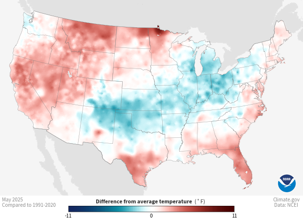
Colors show where and by how much the monthly average temperature differed from the month’s long-term average temperature from 1991-2020. Red areas were warmer than the 30-year average for the month, and blue areas were cooler. White and very light areas had temperatures close to the long-term average.
Daily temperature readings come from weather stations in the Global Historical Climatology Network (GHCN-D). Volunteer observers or automated instruments collect the highest and lowest temperature of the day at each station over the entire month, and submit them to the National Centers for Environmental Information (NCEI). After scientists check the quality of the data to omit any systematic errors, they calculate each station’s monthly average of daily mean temperatures, then plot it on a 5x5 km gridded map. To fill in the grid at locations without stations, a computer program interpolates (or estimates) values, accounting for the distribution of stations and various physical relationships, such as the way temperature changes with elevation. The resulting product is the NOAA Monthly U.S. Climate Gridded Dataset (NClimGrid).
To calculate the difference-from-average temperatures shown on these maps—also called temperature anomalies—NCEI scientists take the average temperature in each 5x5 km grid box for a single month and year, and subtract its 1991-2020 average for the same month. If the result is a positive number, the region was warmer than average. A negative result means the region was cooler than usual.
Shades of blue show places where average monthly temperatures were below their long-term average for the month. Areas shown in shades of pink to red had average temperatures that were warmer than usual. The darker the shade of red or blue, the larger the difference from the long-term average temperature. White and very light areas show where average monthly temperature was the same as or very close to the long-term average.
Comparing an area’s recent temperature to its long-term average can tell how warm or how cool the area is compared to usual. Temperature anomalies also give us a frame of reference to better compare locations. For example, two areas might have each had recent temperatures near 70°F, but 70°F could be above average for one location while below average for another. Knowing an area is much warmer or much cooler than usual can encourage people to pay close attention to on-the-ground conditions that affect daily life and decisions. People check maps like this to judge crop progress, estimate energy use, consider snow and lake ice melt; and to understand impacts on wildfire regimes.
Data Snapshots are derivatives of existing data products: to meet the needs of a broad audience, we present the source data in a simplified visual style. This set of snapshots is based on NClimGrid climate data produced by and available from the National Centers for Environmental Information (NCEI). To produce our images, we invoke a set of scripts that access the source data and represent them according to our selected color ramps on our base maps.
NetCDF (Version: 4)
The data used in these snapshots can be downloaded from different places and in different formats. We used these specific data sources:
References
NOAA Monthly U.S. Climate Gridded Dataset (NClimGrid)
NOAA Monthly U.S. Climate Divisional Database (NClimDiv)
Improved Historical Temperature and Precipitation Time Series for U.S. Climate Divisions
NCEI Monthly National Analysis
Climate at a Glance - Data Information
NCEI Climate Monitoring - All Products
- Data Provider
- National Centers for Environmental Information (NCEI)
- Source Data Product
- NOAA Monthly U.S. Climate Gridded Dataset (NClimGrid)
- Access to Source Data
- NCEI direct HTTPS download
- Reviewer
- Chris Fenimore, National Centers for Environmental Information
