Seasonal heat content in the top half-mile of the ocean compared to the 1955-2006 average. Heat content in the global ocean has been above-average (red bars) since the mid-1990s. Graph by NOAA Climate.gov, based on data from NOAA NCEI.
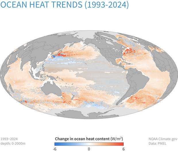
Changes in heat content in the top 2,000 meters (1.2 miles) of the ocean from 1993-2024. More places have gained heat (orange) than lost it (blue). Transparent gray shading means trends are small relative to natural variability. NOAA Climate.gov map, based on data from John Lyman.