Area of snow-covered ground in the Northern Hemisphere each April-June compared to the 1981-2010 average. Snow-covered area has been below average throughout most of the past two decades. Data from Rutgers Snow Lab.
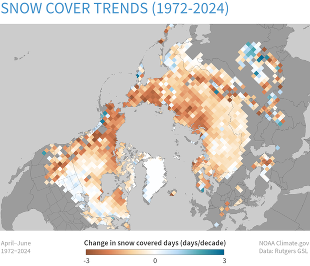
Change in the number of snow-covered days per decade in late spring (April–June) across the Northern Hemisphere. At most locations, late spring snow days are declining (brown). Data from Rutgers Snow Lab.