
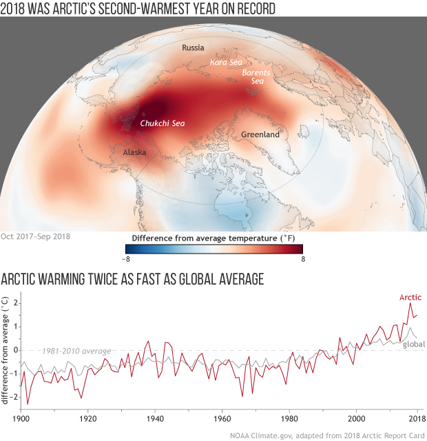
Image caption
Map of the Arctic showing where average annual air temperatures from October 2017–September 2018 were above (red) and below (blue) the 1981–2010 average, based on NCEP reanalysis data. (The Arctic monitoring year runs from October-September to avoid splitting the winter season). The graph tracks difference from average temperature each year from 1900 through September 2018. The red line indicates Arctic temperatures, and the gray line indicates global temperatures. NOAA Climate.gov graphic, adapted from the 2018 Arctic Report Card.