
Image caption
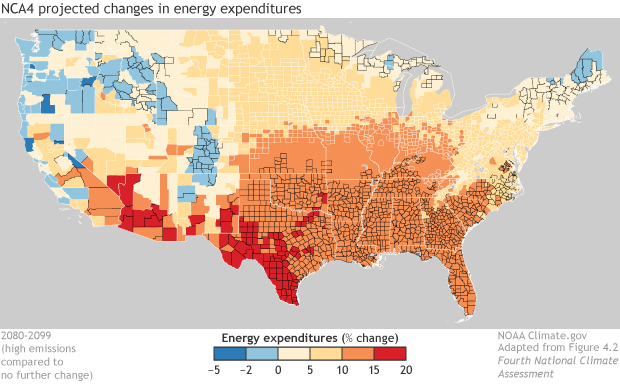
This map shows projected changes in U.S. electricity expenditures by 2080-2099 compared to today. Lower expenditures are blue. Higher expenditures are yellow, orange, or red.
This map shows projected changes in U.S. electricity expenditures by 2080-2099 compared to today. Lower expenditures are blue. Higher expenditures are yellow, orange, or red.