Image caption
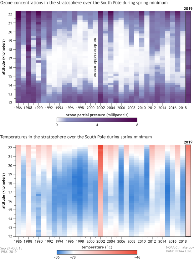
This pair of images shows how the amount of ozone loss in a given year (top) is connected to South Pole spring temperatures (bottom). Each column represents a column of the atmosphere stretching from 12-22 kilometers altitude. The top image shows the lowest ozone amounts recorded at each altitude from September 24–October 15 each year. The bottom shows average temperatures over the same time period. Warm years (red-orange) are mostly correlated with high ozone amounts (dark purple), while cold years (blue) are linked to low—often no—ozone (light purple or white). Climate.gov image, based on data from Bryan Johnson, NOAA ESRL.