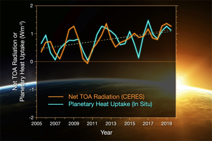
Image caption
This graph compares estimates of net top-of-the-atmosphere annual energy flux from CERES (solid orange line) and an in situ observational estimate of uptake of energy by Earth climate system (solid turquoise line). Credit: NASA/Tim Marvel