
Image caption
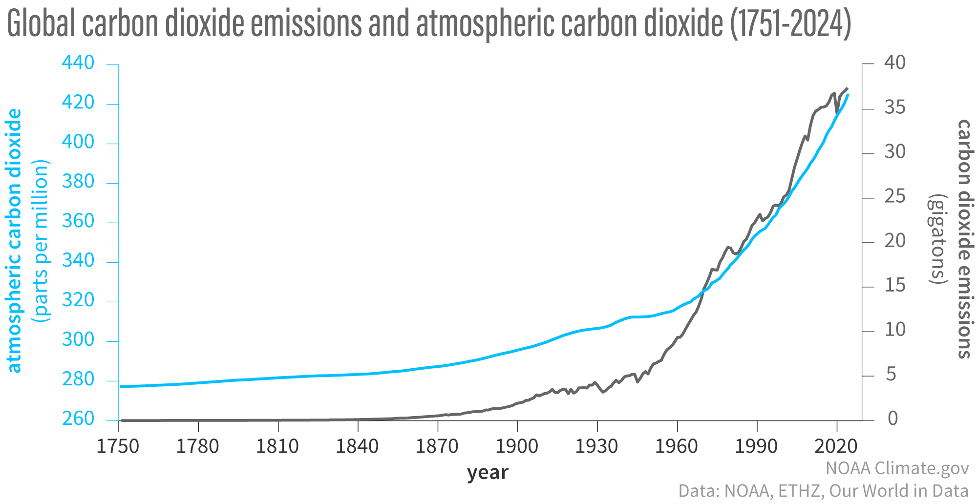
The amount of carbon dioxide in the atmosphere (blue line) has increased along with human emissions (gray line) since the start of the Industrial Revolution in 1750. Emissions rose slowly to about 5 gigatons (1 gigaton is 1 billion metric tons per year) in the mid-20th century before rapidly increasing to more than 35 billion tons per year by the end of the century. NOAA Climate.gov graph, adapted from original by Dr. Howard Diamond (NOAA ARL). Atmospheric carbon dioxide data from NOAA and ETHZ. Carbon dioxide emissions data from Our World in Data and the Global Carbon Project.