
Image caption
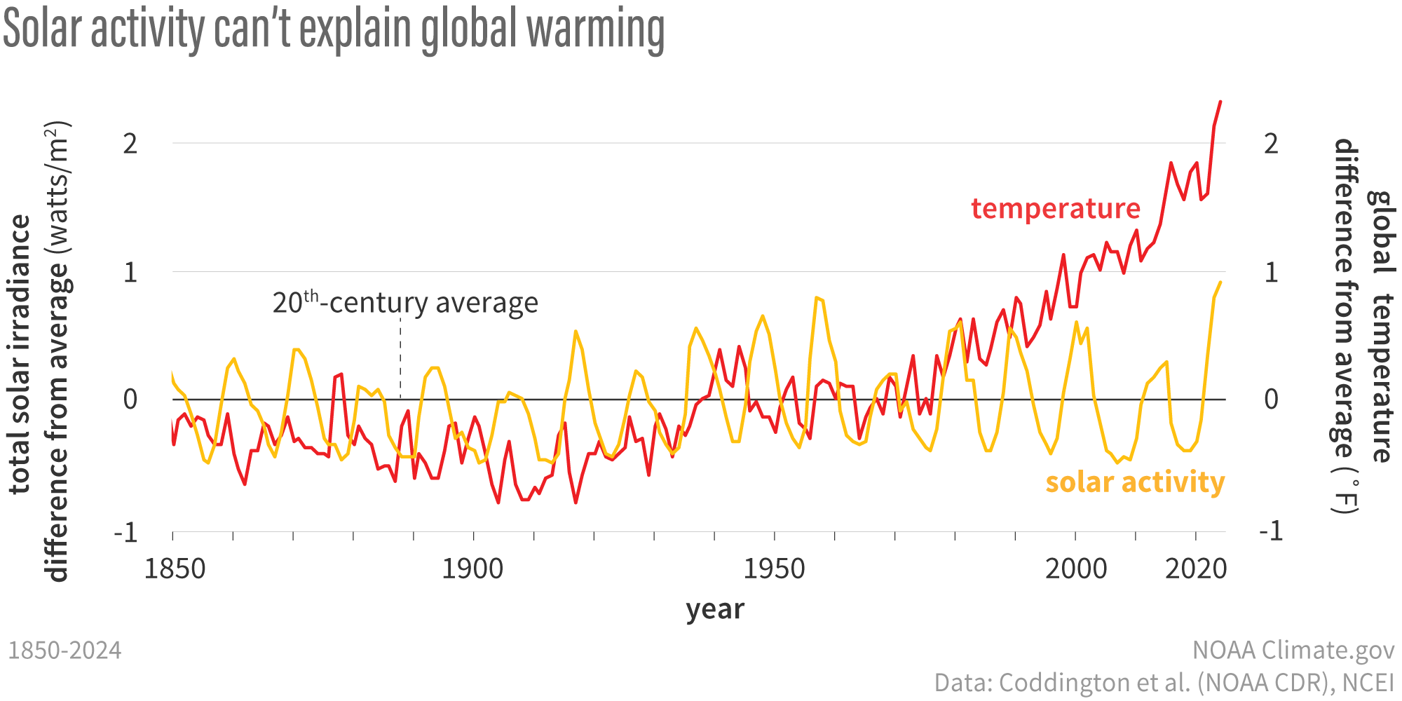
Yearly total solar irradiance (yellow line) and the annual global temperature (red line) from 1850–2024, each compared to the 20th-century average (solid black line) from 1880–2020. Since the middle of the 20th-century, solar activity has declined while global temperature increased rapidly. NOAA Climate.gov image, based on solar data from Coddington et al., 2017, and temperature data from NOAA NCEI.