
Image caption
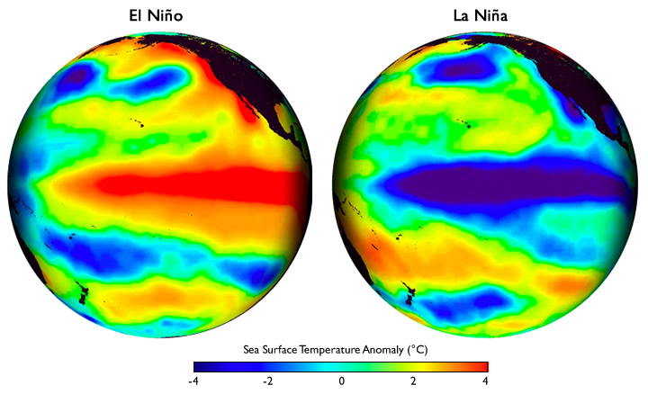
These global maps centered on the Pacific Ocean show patterns of sea surface temperature during El Niño and La Niña episodes. The colors along the equator show areas that are warmer or cooler than the long-term average.
These global maps centered on the Pacific Ocean show patterns of sea surface temperature during El Niño and La Niña episodes. The colors along the equator show areas that are warmer or cooler than the long-term average.