
Image caption
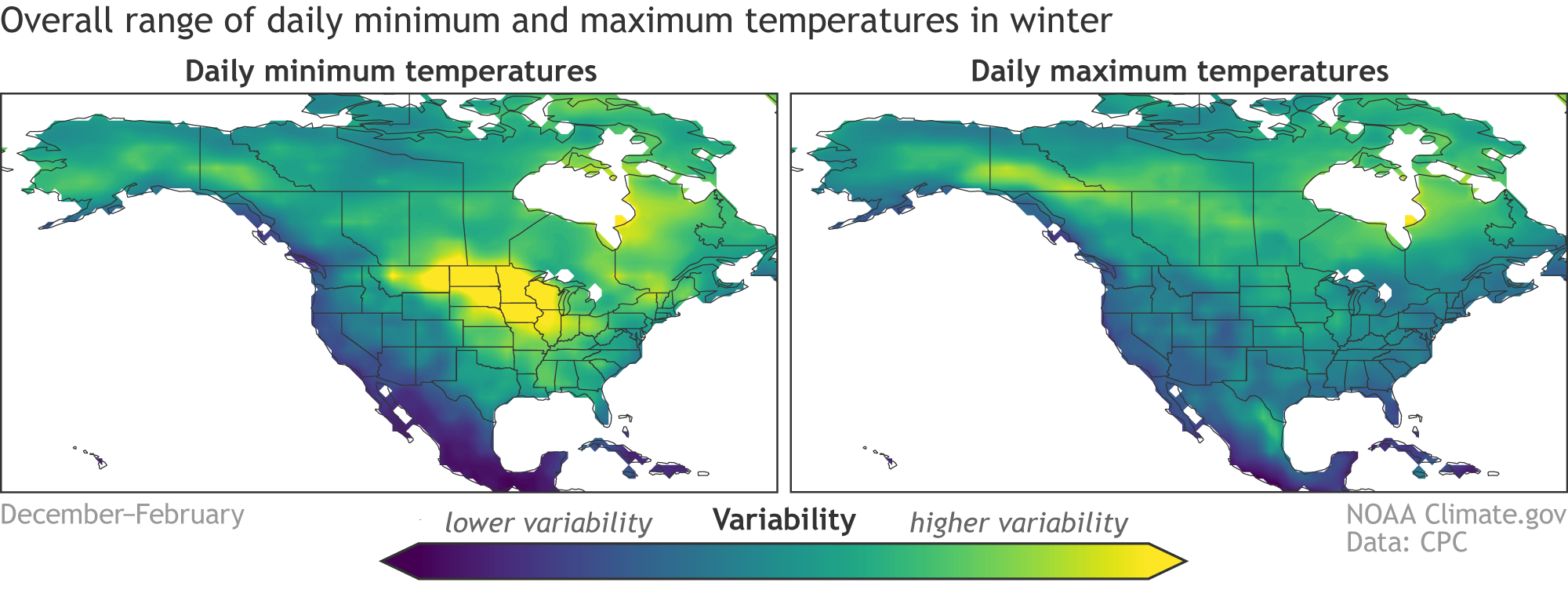
The average variability of daily low temperatures (left) and high temperatures (right) within winter. Yellow regions show where the range of daily temperatures in winter is greatest, while blue shows regions with the narrowest range. The range is assessed using the standard deviation of daily low or high temperature averaged over all winters (December–February), 1950–2020. Daily temperature data source is Berkeley Earth. Map by climate.gov based on analysis by Emily Becker.