
Image caption
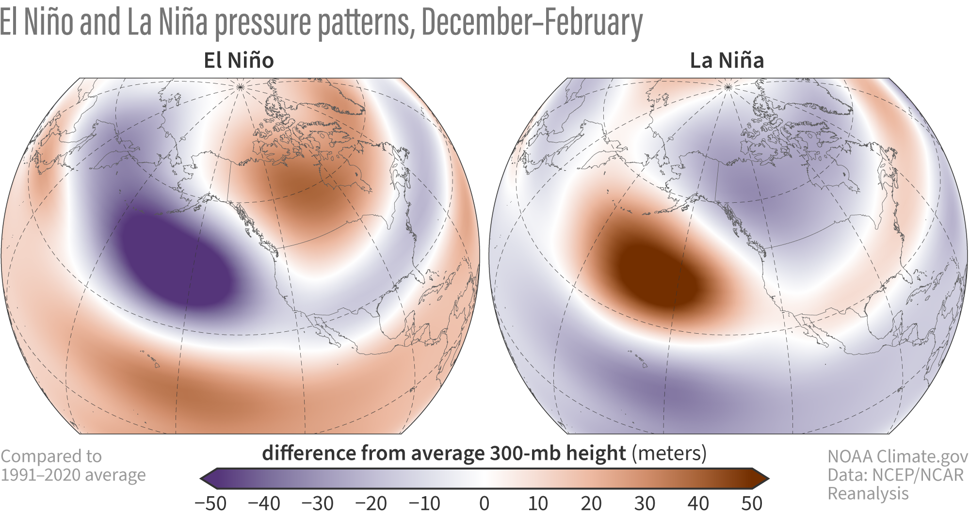
Winter atmospheric pressure patterns during El Niño and La Niña, shown as the 300 mb geopotential height difference from the long-term average, where long-term is 1991–2020. All El Niño and La Niña winters from 1950–2023 are averaged here. The pressure south of Alaska is lower than average during El Niño and higher than average during La Niña. Figure by climate.gov based on data analysis of NCEP/NCAR Reanalysis by Michelle L'Heureux.