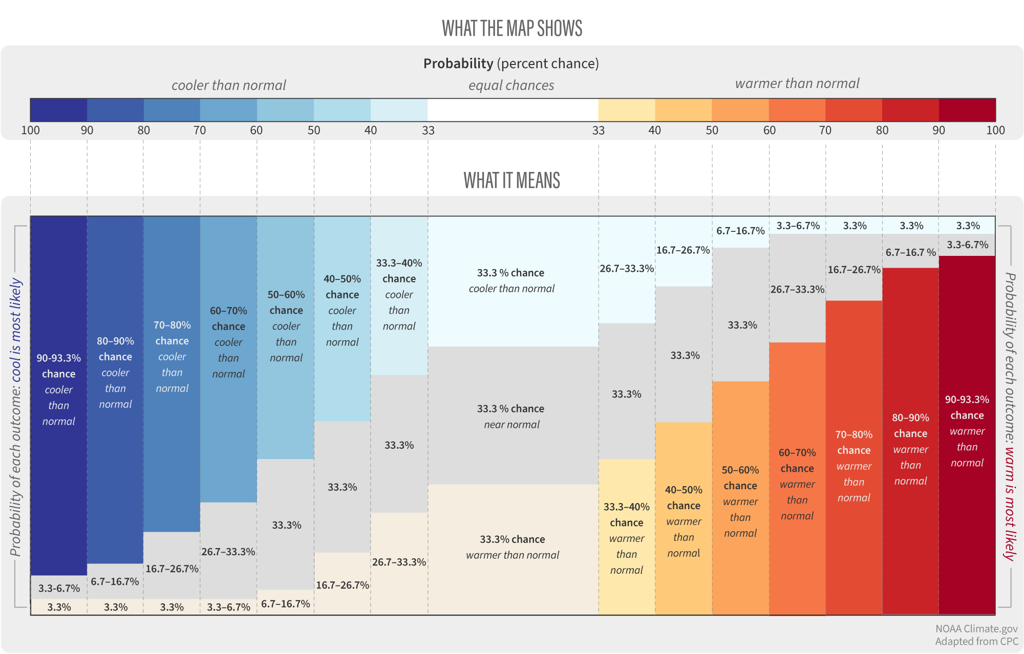
Image caption
A full monthly temperature outlook is made up of three probabilities: the chances for a warmer-than-average month (yellow to red colors), the chances of a near-average month (gray), and the chances of a cooler-than-average month (blue colors). As the chances of one outcome increase, the chances of the opposite outcome decrease—but never all the way to zero. NOAA Climate.gov graphic, adapted from Climate Prediction Center histogram.