
Image caption
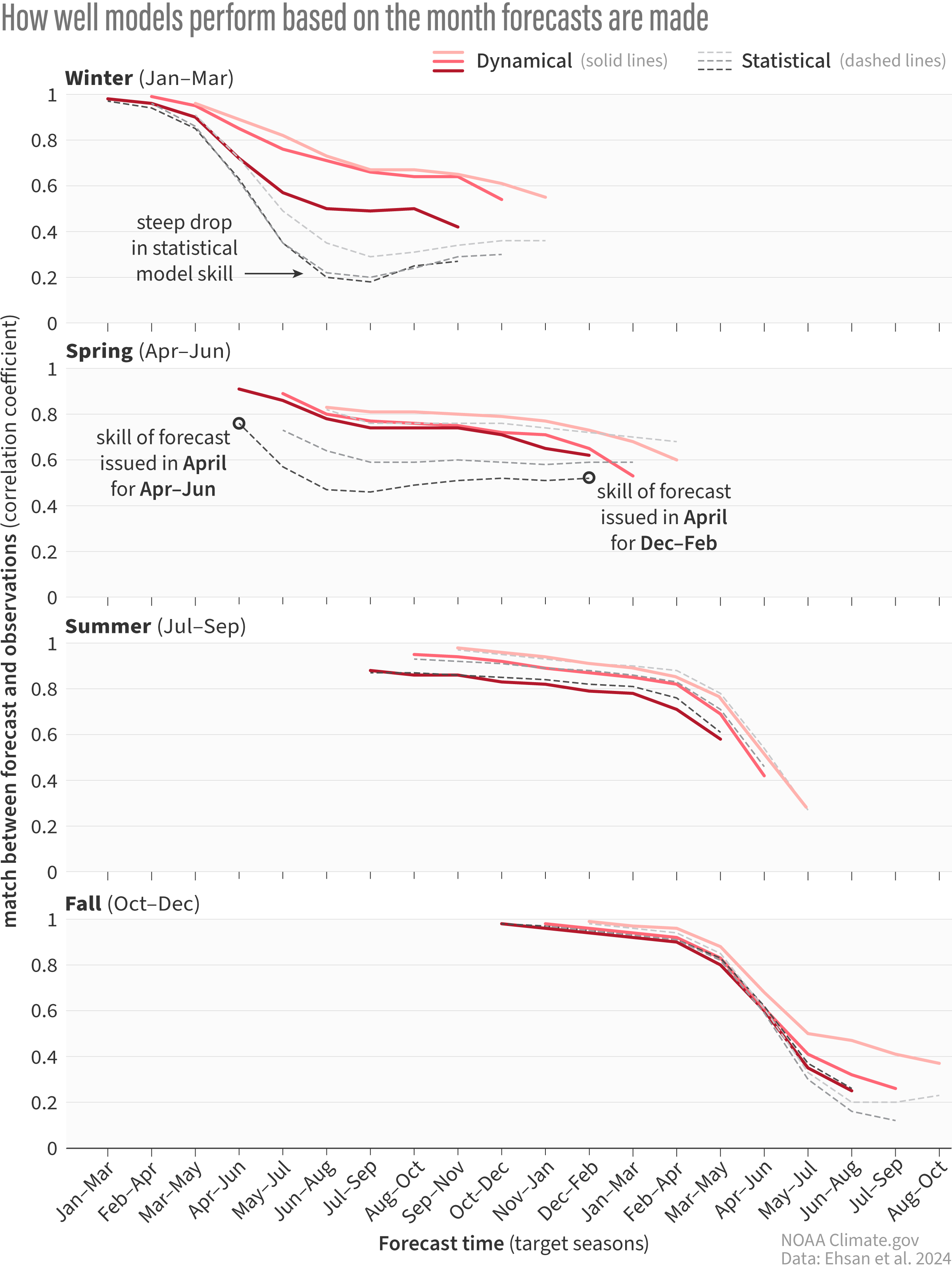
A stacked graph showing the correlation coefficient, or the match between the forecast and observations, of climate model forecasts for nine consecutive three-month periods starting from the month the forecast was issued. One means a perfect match, and zero is the complete opposite. Red lines refer to dynamical models while black dotted lines are statistical models. Each of the four graphs represents forecasts made during months in different seasons. The darkness of the line represents which month the forecast is from, with the darkest lines being the last month in the marked season. In winter, statistical model skill falls rapidly by the spring, while dynamical models don't exhibit nearly as much decline in skill. Forecasts made in spring and summer show similar skill between statistical and dynamical models. Climate.gov image adapted from Ehsan et al., 2024.