
Image caption
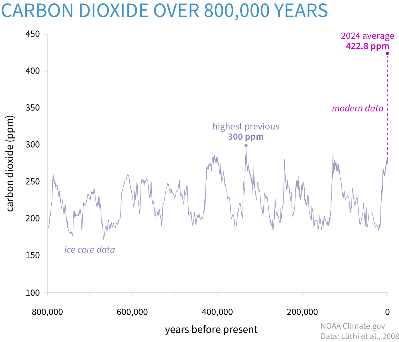
Atmospheric carbon dioxide (CO2) in parts per million (ppm) for the past 800,000 years based on ice-core data (light purple line) compared to 2024 concentrations (bright magenta dot). The peaks and valleys in the line show ice ages (low CO2) and warmer interglacials (higher CO2). Throughout that time, CO2 was never higher than 300 ppm (light purple dot, between 300,000 and 400,000 years ago). The increase over the last 60 years is 100 times faster than previous natural increases. In fact, on the geologic time scale, the increase from the end of the last ice age to the present value of 422.8 ppm (dashed magenta line) looks virtually instantaneous. Graph by NOAA Climate.gov based on data from Lüthi, et al., 2008, via NOAA NCEI Paleoclimatology Program.