Image caption
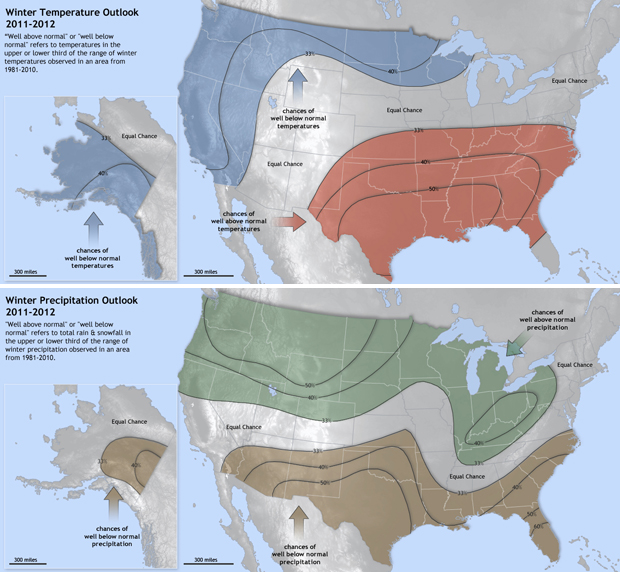
The maps show probabilities of well above or well below normal temperature and precipitation in the continental United States for December 2011-February 2012, according to the official forecast issued by the Climate Prediction Center in late November. Locations that are likely to experience well above or well below normal temperatures are shaded in red or blue; precipitation forecasts are shown in shades of green (well above normal) and brown (well below normal). Places without shading indicate areas where there is an equal chance of well above, well below, or near-normal conditions. Outlook data provided by NOAA's Climate Prediction Center. Maps by Hunter Allen and Richard Rivera, NOAA's Climate Program Office.