
Image caption
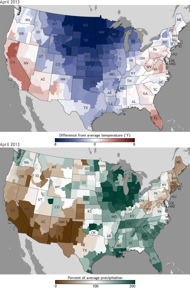
The maps above show the temperature in April 2013 compared to the 1981–2010 average (top) and the percent of average precipitation (bottom) across the United States.
The maps above show the temperature in April 2013 compared to the 1981–2010 average (top) and the percent of average precipitation (bottom) across the United States.