A look at all 173 of NOAA's new global temperature maps
Last week, NOAA National Centers for Environmental Information released a major update to the agency’s global surface temperature dataset. The new product tracks temperatures back to 1850, adding 30 additional years to the historical record, and it has complete geographic coverage over data-sparse areas at the poles.
In honor of the new release, Climate.gov has made a poster-size image showing global temperature patterns for every year in the new data set. Each year’s annual average temperature is compared to the 1991-2020 average, which makes it clear how long-term global warming has affected Earth’s temperature. The farther back in time you look, the colder the temperatures were (darker blues over larger areas) compared today.
Scattered among the blue globes in early decades are years with a wash of red across the eastern tropical Pacific, likely linked to El Niño, the warm phase of the El Niño-Southern Oscillation climate pattern. At the other end of the record, the pattern reverses, with the colder-than-average waters of La Niña standing out on maps that are otherwise dominated by warmer-than-average conditions. Now here's a question for other map geeks: what would the series look like if we had compared each year to the 1851-1880 average? To the 20th-century average?
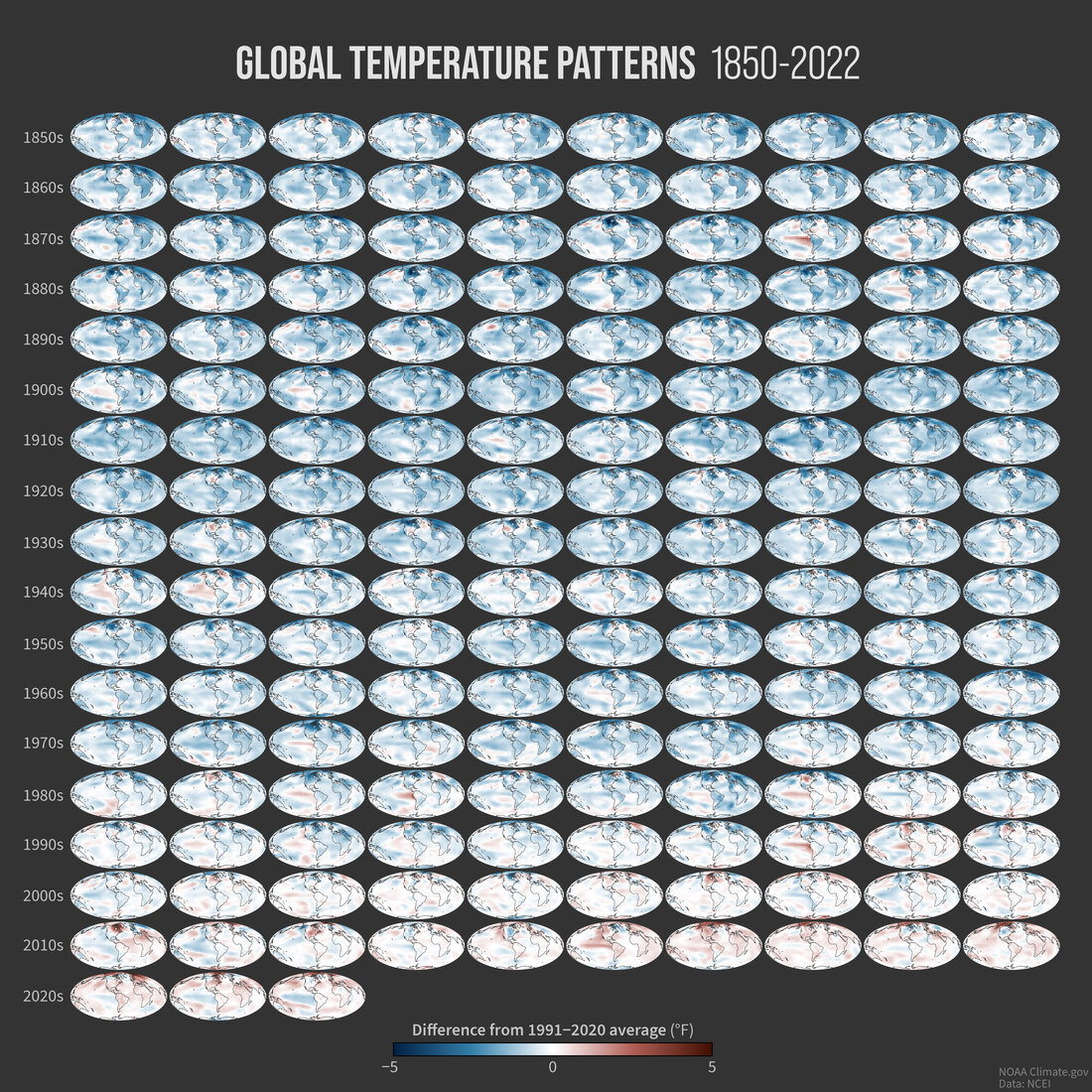
Global average surface temperatures each year from 1850 to 2022 compared to the 1991-2020 average. Blue colors mean cooler-than-average annual temperatures, and red means warmer-than-average temperatures. Image by NOAA Climate.gov, based on data from NOAA National Centers for Environmental Information.
Links
Read more about the new release