2022 Arctic Report Card: image highlights
From shorter snow seasons to increasing ship traffic, NOAA's Arctic Report Card: Update for 2022 provides a broad view of observations and analysis of the Arctic environment and how rapid changes are affecting wildlife and people. Below is collection of maps and charts showing some of the report's major findings. You can also read the NOAA press release, watch a video summary, or explore the full Arctic Report Card: Update for 2022.
Image highlights
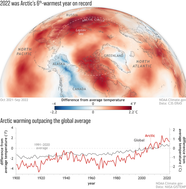
(map) Near-surface air temperatures across the Arctic from October 2021-September 2022 compared to the 1991-2020 average. Most of the Arctic was warmer than average (red) during the monitoring year, though Alaska was notably cooler-than-average (blue). (graph) Annual temperatures in the Arctic (red line) are increasing more rapidly than the global average (gray line). Read the full story. NOAA Climate.gov image, based on ERA5 reanalysis (map) and NASA (graph) data.
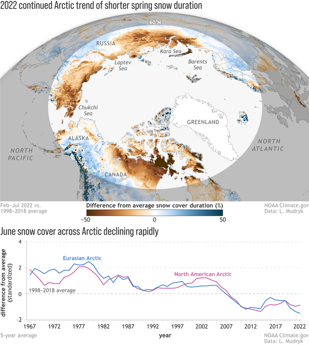
(map) This map shows spring snow duration—how long the ground remained snow-covered from February–July—in 2022 compared to the 1998-2018 average. Most of the Arctic had fewer snow-covered days than average (brown). (graph) June snow cover compared to the 1998-2018 average for the Eurasian (blue line) and North American (purple) Arctic from 1967–2022. Read the full story. NOAA Climate.gov, based on data provided by Lawrence Mudryk.
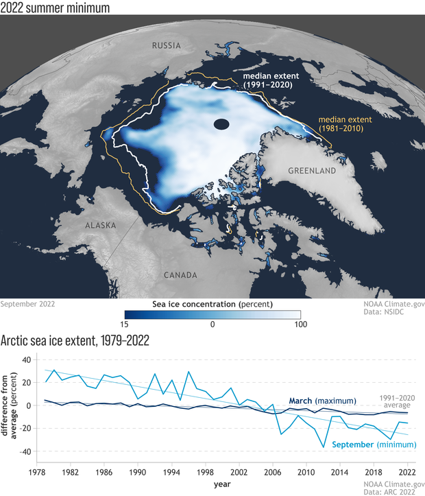
(map) End-of-summer sea ice concentration across the Arctic in September 2022. The ice cover was below the 1991-2020 median (white line) and well below the 1981-2020 median (gold line). Median means in the middle of the historical record; half of the years on record had larger extents and half had smaller extents. (graph) Both the annual maximum ice extent in March (dark blue) and the annual minimum extent in September (bright blue) have declined over the satellite era. Read more. NOAA Climate.gov map and graph, based on data provided by NSIDC and Walt Meier.
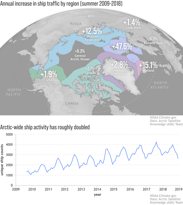
(map) Annual percent increase in summer ship activity in the Arctic. Bold numbers indicate where trends were statistically significant. The biggest increases have occurred in the waters of Norway and Iceland. (graph) Monthly unique ship counts Arctic-wide show that activity is increasing overall. Read the full story. Image by NOAA Climate.gov, based on data from the Arctic Satellite Knowledge Team.
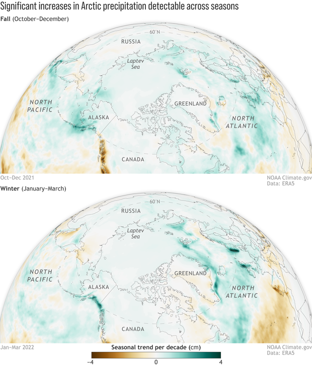
Between 1950 and 2022, seasonal precipitation has been increasing across most of the Arctic in fall (October-December) and winter (January-March). The darker the color, the bigger the change over the past ~70 years: green for places that have grown wetter, brown for places that have grown drier. Read the full story. NOAA Climate.gov maps, based on ERA5 reanalysis data provided by Siiri Bigalke.
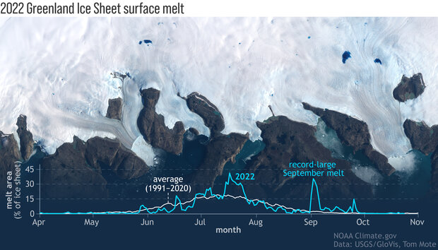
The melt season on the Greenland Ice Sheet typically ends in August, but two significant melt spikes occurred in September 2022. The graph traces the daily melt area of the ice sheet in 2022 (blue) compared to the 1991-2020 average (white). The background image shows electric blue melt lakes on the ice sheet near Ilulissat, on the west coast (North has been rotated counterclockwise about 90 degrees), on September 1, 2022. Read the full story. NOAA Climate.gov image, based on Landsat data from GLOVIS and melt data provided by Tom Mote.