Verification of the 2022-2023 U.S. winter outlook
Don’t look now, but it’s winter outlook verification time! A time when I like to take readers on a statistical sojourn, a mathematical migration, through last year’s winter outlook. By the end of this post, you’ll have been provided with a non-alcoholic, numbered nightcap in the form of an answer to the question “How did the winter outlook do?” (Sorry. I’m in an alliterative mood.)
But first, my yearly warning that some math is involved in this post. Because while it may be easiest to just use our eyes to verify whether the forecast map matched the real winter, our eyes can lie. Plus, we aren’t looking for an easy way out. We’re the ENSO Blog, and you are ENSO Blog readers, for Pete’s sake! No one here is afraid of math, right?! And to properly put this year’s outlook into perspective, we need to use consistent statistical metrics. The good news is that I’ve already covered the complicated aspects of statistical verification in eight previous posts at the ENSO Blog. One. Two. Three. Four. Five. Six. Seven. Eight. Head there to nerd out.
Still, I’ll repeat some basics: The winter outlooks for temperature and precipitation are for the probability that seasonal average temperatures and total precipitation will be either above average, below average, or near average. The Winter Outlook map we normally see is showing only the category that has the highest chance of the three. If all chances are the same (called “Equal Chances”), the location is colored in white (1). Note that the “highest” probabilities are never that high. In last winter’s outlook, the highest probability issued was 50-60%. There is simply too much uncertainty in seasonal predictions to warrant probabilities anywhere close to 100% in any of the three categories (2). It’s important to remind ourselves what these outlooks are actually predicting before we even begin to look into how they did.
Let’s verify! (3)
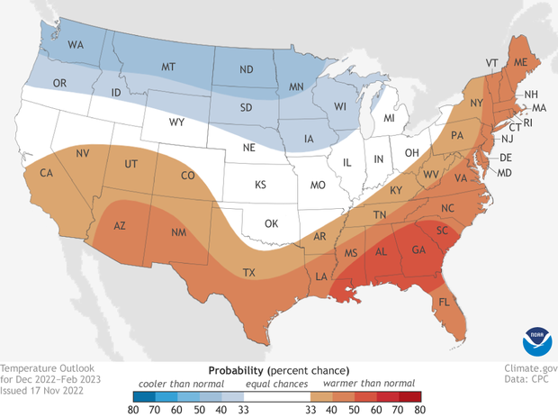
Places where the forecast odds favor a much colder than usual winter (blue colors) or much warmer than usual winter (red), or where the probability of a cold winter, a warm winter, or a near-normal winter are all equal (white). The darker the color, the stronger the chance of that outcome (not the bigger the departure from average). Click here for a version that includes Alaska. Click here for a text-only discussion for Hawaii. NOAA Climate.gov map, based on data from NOAA CPC.
Did the temperature outlook run hot…or cold?
The winter temperature outlook for 2022-2023 favored warmer-than-average seasonal temperatures across the eastern and southern contiguous United States and cooler-than-average temperatures across the northern tier from the upper peninsula of Michigan to the West Coast.
This outlook bore a close resemblance to the previous two winter outlooks as well as the typical winter impacts during La Niña. All of which makes sense as this was the third straight Northern Hemisphere winter with La Niña conditions present. But, while the state of the El Niño-Southern Oscillation (ENSO) is one of the two best sources of skill in seasonal predictions (the trend is the other), it’s not the only influence.
In reality, winter temperatures across the contiguous U.S. exhibited a pretty dramatic east/west split, as the eastern half of the country observed above-average temperatures (top five warmest on record for 19 different states), while temperatures were below average across the western half of the country.
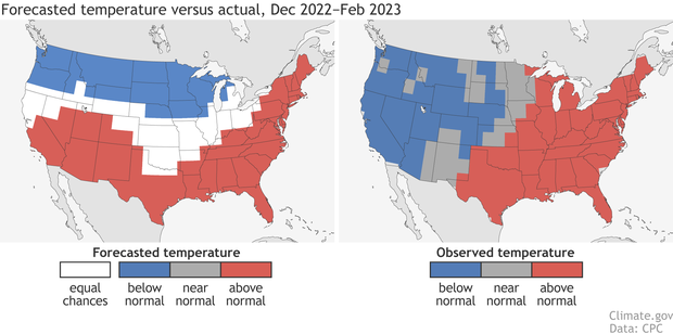
(left) The winter temperature outcome forecasters considered most likely back in mid-November 2022: red where a much warmer than average winter was favored, blue where a much colder than average winter was favored, and white where a warmer, cooler, or near-average winter were all equally likely. (right) The observed temperatures for December 2022-February 2023. Maps by NOAA Climate.gov, based on data from the Climate Prediction Center.
Overall, it was a pretty good temperature outlook. The warmth over the eastern and southeastern U.S. verified as well as the cooler-than-average temperatures for the northern tier from the Dakotas on west. Eyeballing this, the biggest differences between forecast and actual conditions were over the Southwest and the northwestern Great Lakes.
But don’t trust your eyes, VERIFY (with math). For this, the Climate Prediction Center uses a metric known as the Heidke Skill Score (HSS) (available here). The HSS is a tough scoring system. It doesn't just grade the outlook based on how often it hit or missed the mark. It also subtracts some points based on how often the forecast might have been right simply by luck. An HSS score greater than zero means the outlook was better than randomly choosing one of the three categories (meaning the forecast had “skill”.) The better the forecast, the higher the HSS. (4)
And the HSS for the 2022-2023 winter temperature outlook was nearly 30 for the contiguous US, and nearly 39 when only looking at areas where forecasters favored one category over the others (non-equal chance areas). Meaning this outlook (like 8 of the last 10, and 16 of the last 20 winter temperature outlooks) was better than a random forecast.
Predicting the future is never going to be 100% on the mark. Our planet is simply too chaotic, our observations too imperfect, and our models too uncertain to expect every winter outlook to be “THE BEST EVA”. That’s why the outlooks use probabilities, and that’s why it is all about playing the “long game” with seasonal outlooks. After all, 16 out 20 winters with HSS scores above 0 ain’t bad at all.
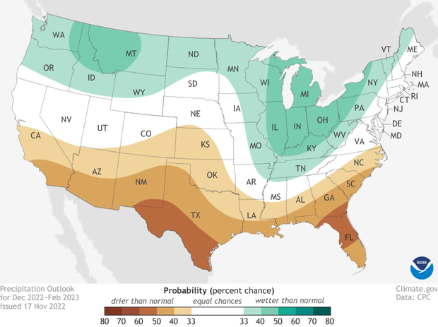
Places where the forecast odds favor a much wetter than usual winter (green colors) or much drier than usual winter (brown), or where the probability of a wet winter, a dry winter, or a near-normal winter are all equal (white). The darker the color, the stronger the chance of that outcome (not the bigger the departure from average). Click here for a version that includes Alaska. Click here for a text-only discussion for Hawaii. NOAA Climate.gov map, based on data from NOAA CPC.
Did the precipitation outlook leave us high and dry?
The 2022-2023 winter precipitation outlook favored a drier-than-average season for the southern tier and wetter-than-average conditions for the northern tier and Midwest. Like the temperature outlook, the precipitation outlook also was similar to the outlooks during the past two winters due to the continued existence of La Niña.
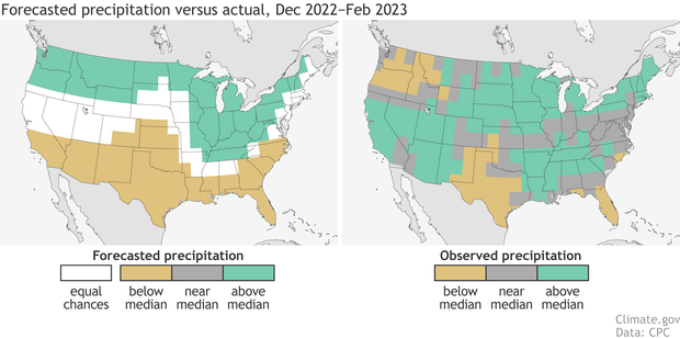
(left) The winter precipitation outcome forecasters considered most likely back in mid-November 2022: green where a much wetter than average winter was favored, brown where a much drier than average winter was favored, and white where a much wetter, a much drier, or near-average winter were all equally likely. (right) The observed precipitation for December 2022-February 2023. Maps by NOAA Climate.gov, based on data from the Climate Prediction Center.
Overall, the precipitation outlook had a HSS of 9 for the country as a whole, which rose to 12 when looking just at locations where the outlook favored one category over the others (i.e., leaving out the “equal chances” areas. Which is good! Again, that’s better than a random guess, and precipitation is generally harder to predict than temperature.
The outlook favoring a drier-than-average winter in Texas and Florida was right on, along with favoring a wetter-than-average winter for the Great Lakes and Northeast. But out west, the Pacific Northwest ended up drier than average and southern California wetter than average. This is a good example of how the forecast as a whole can have skill even if the outlook favored the wrong category in a couple of regions.
So, what happened out West?
Nat did an excellent job at the blog showing how above-average precipitation in the Southwest can sometimes occur during a La Niña winter, and how this year’s drenching rain and heavy snow might just have been the result of seasonally unpredictable weather conditions. I know that isn’t a satisfying answer. But when it comes to Earth, sometimes that’s the best we’ve got.
Why? Because sometimes relatively small differences from expectation can lead to big differences in outcomes. Let me explain. When we talk about a “La Niña pattern” for winter, that means, averaged over the entire season, an area of higher pressure than normal south of Alaska over the North Pacific, and a retracted jet stream across the Pacific. And that’s pretty much what happened, averaged across the whole winter. With one change. Let’s compare this year to the average of the four strongest La Niña winters since 1950 (1973-74,1975-76, 1988-89, and 1999-2000). In 2022-2023, the high-pressure anomaly was a bit farther west and north, which also meant the low-pressure anomaly was farther west and south, right over the West Coast (5).
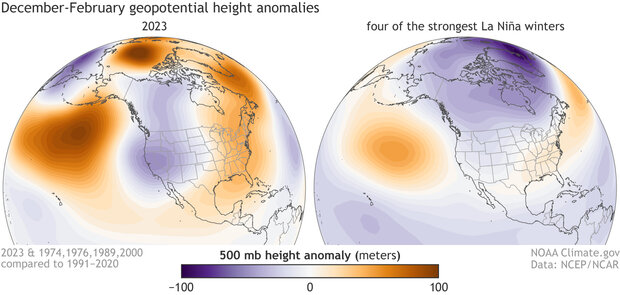
These maps show how this winter's pressure anomalies (left) did resemble the typical pressure patterns during four of the strongest La Niñas on record (right). Both maps have a trio of alternating pressure anomalies stretching from the North Pacific to the eastern United States: high over the North Pacific (orange-brown), low over the West (purple), and high over the East (orange). But the exact boundaries and strength were a little off, and those small differences had a big influence on the precipitation outcome in parts of the West. Maps by NOAA Climate.gov, based on NCEP/NCAR reanalysis data from NOAA's Physical Science Lab.
Simply put, when it comes to the winter atmospheric pattern, this doesn’t seem to be a case where the models and forecasters were predicting a dog, and reality was an ice cream cone. It was more like they were predicting an English bulldog, and reality was a French bulldog. But, still, that difference was enough to see tremendous rain and snow across California that washed out roads, and stranded residents in their houses for days.
Let’s not forget, though, that even with the miss in parts of the West, this was another pretty good outlook, since the HSS scores were positive. That means that CPC forecasters were able to pull out some of the climate signals ahead of time. Which is quite amazing given they are up against the relentless, uncertain chaos of our atmosphere.
Thank you to Johnna Infanti, Matt Rosencrans, and Scott Handel for their review and feedback on this post.
Footnotes
- Let’s break this down a bit more in case anyone is still confused. Using the winter temperature outlook map as an example, for any point on that map, there are actually three forecasts being made: one for above-average temperatures, one for below-average temperatures, and one for the chance of near-average temperatures. When added together, the probabilities will equal 100%.
- Why is there so much uncertainty? Here’s a brief list of other things besides ENSO that can impact seasonal patterns: climate trends, sudden stratospheric warmings, the Madden-Julian Oscillation (MJO), the Arctic Oscillation/North Atlantic Oscillation, the North Pacific Oscillation-West Pacific teleconnection, and the Pacific/North American pattern. And pretty much nearly all of these are not that predictable months in advance when the outlooks are made.
- Reminder that this post is about the verification of the updated Winter Outlook made in mid-November 2022, not the Winter Outlook issued in mid-October 2022.
- The HSS equation is HSS = 100*(H-E)/(T-E), where H is the number of correct forecasts, E is the expected number of correct forecasts by luck, and T is the total number of forecasts. A score of 100 means a perfect forecast, a score greater than zero means a forecast is better than expected from luck, and a score of -50 means the forecast was completely wrong with the favored category not occurring anywhere on the map.
- Extending this picture even farther to the west, a large low-pressure anomaly was also present over Siberia, a feature that was not present during any of the four strongest La Niñas. In 2023, you can clearly see a Rossby wave train spanning almost the entire planet: high, low, high, low high, low.
Comments
Comment policy
Verification of Winter Outlook
Greetings,
NOAA did not do a good job on the winter temperature outlook. To say you did is scientific gaslighting. A simple visual comparison easily shows major forecast problems vs. observed.
Thanks,
John Eise
NOAA/NWS (Retired)
A simple visual comparison
Your comment makes Tom's case for him about why we don't evaluate forecasts based on simple visual comparisons. Anyone can look at the maps and set their own subjective standard for what counts as "a good match." One person might not be satisfied unless it were a perfect match (though this is impossible to achieve because some aspects of the climate system are fundamentally not predictable and never will be). Another person might consider it a good forecast if at least 80 percent of the maps match, another might feel like anything greater than 50 percent is good.
My simple visual comparison of these maps concludes that the temp forecast verified for Texas, Louisiana, Missouri, Mississippi, Alabama, Georgia, Florida, South Carolina, North Carolina, Tennessee, Kentucky, West Virginia, Virginia, Maryland, Delaware, Pennsylvania, New Jersey, New York, Connecticut, Rhode Island, Vermont, New Hampshire, Maine, most of Washington, Oregon, Idaho, Montana, and Wyoming, and around half of North Dakota, South Dakota, and Nebraska.
That's far from perfect, but that's a lot of states! It's definitely not gaslighting. Personally, I would call that pretty good! You might call it lousy. That's why they don't score forecasts based on people's subjective judgments.
The HSS provides an objective, statistically consistent way to rank them. A score of zero means no better than you'd expect from guessing "above" a third of the time, "below" a third of the time, and "average" a third of the time. Anything above that means there was some skill. Now sure, we can argue about just how far above zero it needs to be to be practically useful for a particular purpose, but it definitely doesn't have to be perfect to be useful.
Why Did You Not Compare to Your October 2022 Predictions
Why did you not compare to your October 2022 forecast?
Hi Geoffrey, Essentially,…
Hi Geoffrey,
Essentially, because we have to choose one, so we go with the most recent prediction for the target season.
Forecast
Dear Sir,
it's enough to look at the forecasted and observed map to see and know you were dead wrong.
2022-23 Winter Outlook
Dear NOAA -
John Eise is more right than wrong - -
And Rebecca Lindsey is more wrong than right.
After all, the Titanic did make it 2/3s of the way across the Atlantic -
without any problems.
The temperature outlook completely missed the overall pattern.
NOAA painted it as north-south and it was east-west.
A quick glance - with or without the math - would suffice.
The precipitation outlook was also badly off.
NOAA said California would have another dry winter.
That is a Titanic-level error this season.
And as for the math -
(I have a stats background in addition to my history doctoral work.
And I received 800s on both the SAT and GRE exams.)
If you have 3 options - more, neutral, or less -
And you have 3 results - more, neutral, or less -
Then you can have 9 possible results:
More-more; more-neutral; more-less
Neutral-more; neutral-neutral; neutral-less
Less-more; less-neutral; less-less.
Technically, you have only a 1/3 chance of getting it right.
but if neutral is a wash on either end,
then your chances of getting it wrong drop to 2 in 9.
i.e. Only more-less or less-more would be considered wrong.
I'd take those odds in Vegas any day.
<<<>>>
One of the reasons for the dramatic deline in public trust
in government, in business, in education -
is the near-reverential dependence on the algorithm
despite all evidence to the contrary.
This year's NOAA outlook was way off the mark.
If the algorithm says otherwise -
perhaps it is time to reconsider the algorithm.
Or else buy a ticket on the Titanic.
Regards -
John Egan
Buffalo, WY
PS -
I am reminded of the famous epitath in Tombstone, Arizona.
"Here lies Lester Moore
Four slugs from a '44
No Les, no more."
Forecasts
You do realize that the outlooks and the models that are part of the forecasting is based on probability?
Probabilities
There are probabilities and there are probabilities. (I have a stats degree.) The good people aboard the Titanic has a very high probability of making it across the Atlantic safely. Investigations showed at least a half dozen things that might have prevented the sinking.
I do not have access to the NOAA models, but one might wonder whether or not any showed some degree of the record-breaking precipitation and significant cold that has impacted the West. And, instead of self-praise, asking why the models failed to indicate such a major climate event only weeks prior.
model spread
You can have some idea of the variations in the seasonal forecasts, including if any individual runs were close to what verified, in CPC's attribution of seasonal anomalies. This analysis does not focus on a particular region, like the Southwest, but it does give a broader perspective. For example, if you go to the slides for this past winter and check out slide 24 (top left panel), you can see some of the individual ensemble members did pretty well at predicting the North America precipitation pattern, whereas other members did quite poorly (spatial correlations less than zero).
What's important to remember is that the variations among those 40 model members are due entirely to tiny perturbations in the initial conditions (like the effects of tiny flaps of a butterfly's wings), and that's enough to be the difference between a really bad forecast (spatial correlation ~ -0.4) and a decent forecast (spatial correlation ~0.4). These are tiny uncertainties in the initial state that we cannot possibly ever expect to capture in a seasonal prediction system, and that's why chaotic weather and climate variability will always be a limiting factor in our seasonal predictions (and why they always will be expressed in probabilities). This is the same idea in my blog post from last month.
I am not sure if any model members captured the magnitude of the cold and wet anomalies in the West, but I wouldn't be surprised if some did. Actually, if you look at the bottom right of slides 26 and 28, you can see that the best 4 model runs do capture the wet and cold conditions in the West pretty well. Again, the only things that distinguish those 4 best model runs from the other poorer model runs are those tiny butterfly-flap perturbations in the initial conditions. So, I agree that it's important to question why the forecast did not verify where extreme conditions did occur, and we should (and do) look deeply into the forecast data, but these results already tell us that it's difficult to underestimate the potential role of seasonally unpredictable, chaotic weather variability.
As if there is any similar…
As if there is any similar comparison between the two
Pretty good job on the forecast
Reading this post and looking at the maps, it looks like your winter outlook was fairly accurate. So, not bad.
Here's hoping that you are able to get more and better measurements in the future, so forecast accuracy improves.
Continuation
As an addendum, it is my understanding that the Earth's climate has a lot of moving parts, and that it sometimes (often?) behaves differently than expected. So, when making predictions, you have to speak in terms of possibilities and probabilities rather than certainties--especially when it comes to trying to forecast what the weather will be like over an upcoming season (which is undoubtedly quite challenging).
So, once again, you did pretty good with making a seasonal forecast that was more accurate than one based on random chance would have been.
As an aside, you're all very highly trained and educated (I think most of you have PhD's, plus I suspect most of you have years [if not decades] of experience with weather forecasting), plus you're using some very powerful computers to make forecasts, to say nothing of how you are getting weather data and forecasts from other meteorological agencies around the world (which undoubtedly improves your forecasts).
What you are doing (forecasting the weather both for the coming days and the upcoming season) is not easy: It would take years of education and experience to be able to do what you do, and even more time to make it look easy.
Besides, I know your forecasts have improved over the years, and that they are more accurate now than they have ever been, so we all benefit. And, I have no doubt that they will continue to improve over the coming years, because of better computers, better programs, more and better data--and highly skilled meteorologists who know how to put those to use.
Question about weather features
Questions:
* Any idea why this year's La Niña high pressure anomaly in the North Pacific was a bit further north and west than normal?
* Do you have any insights or thoughts as to why there was a low pressure anomaly over Siberia last winter?
recent winter features
I don't have any piercing insights into why we saw those two features over the past two winters. As a starting point, I would go back to CPC's seasonal attribution page that I mentioned in a previous comment. For this past winter, the verified North Pacific high anomaly was a bit west of the anomaly in both the forecasts and the simulations that were forced by the observed sea surface temperatures (the simulations labeled as "AMIP"). This would suggest that chaotic weather variability may have been the culprit, and if so, then we would have to look for subseasonal phenomena (like the Madden-Julian Oscillation or upstream Rossby wave trains) for further attribution. But even if we can point to such phenomena, they would not be too relevant for seasonal predictions since they vary quite a bit from week to week.
It's pretty much the same story for the previous winter. I will note that Siberia has a very wide range of chaotic weather variability ("weather noise"), which means they can have pretty big weather swings that are not evident in seasonal predictions. There is some debate about the possible roles of Arctic variability (like with sea ice) that perhaps our models do not capture well, but at this point, chaotic weather variability rooted entirely in the atmosphere is a difficult null hypothesis to reject.
Would like more data
I would like to suggest adding a couple more stats to your evaluation. Depending on one (HSS) is typically dangerous when trying to conclude from a single score. It would be great to actually show the graphic with the actual HSS over the US at a minimum. In my past career doing forecast evaluation, each score has it's good and bad points, and only when all available stats point to the same result provided the good answers to folk footing the bill ($$; experience in modeling stats, severe weather and aviation forecast evaluation). But nice to see a group provide some look back into what happened...sort of an outlier in NOAA/NWS.
Mary Cairns
NOAA/NWS/FAA Retired
Thank you and I completely…
Thank you and I completely agree. CPC does monitor other metrics and ideally they would be provided on this site:
https://www.cpc.ncep.noaa.gov/products/verification/summary/index.php
The page currently isn't fully functional. I know that NCO (NCEP Central Operations) has to implement a fix and hopefully that will happen soon.
Comment then a Question on West Coast SST
In my opinion NOAA did a great job in forecasting the Winter pattern in the Ohio Valley.
When will the cold SST on the West Coast begin to increase to their normal levels ?
That's a good question…
That's a good question... you can see some forecasts for the North Pacific SST anomalies in CPC's monthly ocean briefing. Slide #27 has a prediction from the CFSv2. Looks like more "average" conditions are expected along the coast by May 2023.
Reply
Thank you Michelle for your reply to my question. Keep up the great work on the ENSO Blog.
Stephen S.
2022/2023 Winter forecast and factual observences!
How much do you think the fact that we were in the third year of a La Nina pattern which is quite rare and now into a neutral and shifting into an El Nino pattern had to do with this prediction being so far off the mark? Has this been taken into consideration?
Hi Michael, That's a good…
Hi Michael,
That's a good question. There have only been two other times since 1950 when we had a triple dip La Nina so we don't really know if there is a specific pattern associated with it.
But figuring out how we can better predict some of the climate phenomena besides ENSO that we know can strongly influence the seasonal temperature and precipitation patterns is an ongoing effort.
Comments have been disabled on this article