Untangling the winter 2023-24 precipitation forecast ball of yarn
Editor’s Note: Clara Deser and Stephen Yeager presented this work at a seminar (video here) in early March 2024, permitted us to share their research, and reviewed this article. They are preparing a manuscript, which is tentatively titled “Predicting the 2023/2024 El Nino and its climate impacts over North America” which will include additional technical details.
Climate scientists are basically cats. Climate forecasts, especially those generated from complex computer models, are their balls of yarn – bundles that hide an entangled mess of complex interactions that lie beneath the surface. We all know what happens when a cat sees a messy, tangled knot of string. They stalk it, pounce, and eventually pull apart all the string. Today I’m introducing you to two esteemed cats, Clara Deser and Stephen Yeager, who are climate scientists at the National Center for Atmospheric Research (NCAR). They’ve been tumbling around with a ball of yarn and, whew, you should see that ball now. It’s been picked apart. Ravaged. And the outcome is very, very interesting.
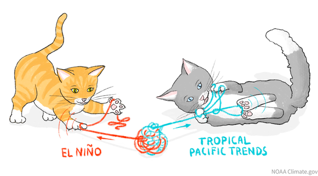
Cartoon by Anna Eshelman, climate.gov.
Let me explain. First, I should probably clarify that Clara and Stephen are NOT actual cats, but they have been working on a problem that our blog team has investigated, and readers have been asking about. How much influence did El Niño have on the winter 2023–24 precipitation model prediction over the United States? And were there other climate drivers that may have influenced the forecast?
This problem of determining the specific influences behind a forecast (or an event) is known as attribution. It’s a challenging business, but Clara, Stephen, and many other scientists (footnote #1) have been willing to take it on.
Why is forecast attribution so challenging? When we stare at a climate forecast, we often don’t know exactly what factors are causing the prediction. This is because when we run a climate model, we dump in as many recent observations as possible from all over the earth so we know the best state the model should begin from. Then the model is run forward using mathematical equations that reflect our physical understanding of the Earth system, creating all sorts of complicated interactions among the ocean, atmosphere, land, and ice. It’s quite a tangled ball of yarn.
Stalking their prey
These clever cats, I mean scientists, realized to get this ball untangled they would have to come up with a few innovative experiments. They knew a strong El Niño would be influencing the 2023-24 winter, but they were also aware of another possible culprit for the precipitation patterns we saw in the forecast. That prime suspect is climate change trends in sea surface temperature in the tropical Pacific Ocean, a topic we’ve covered in this blog article.
In today’s climate, tropical Pacific waters are much warmer in the west (the Indo-Pacific “warm pool”) relative to the east (the eastern Pacific “cold tongue”). In a nutshell, most climate change simulations project that this east-west contrast (or gradient) in sea surface temperature along the equatorial Pacific Ocean will weaken, as the east warms faster that the west. However, since at least the start of the modern satellite era (1979), we have seen the opposite: a strengthening gradient, with waters warming more in the western Pacific than in the eastern Pacific. See the top left map in the image below.
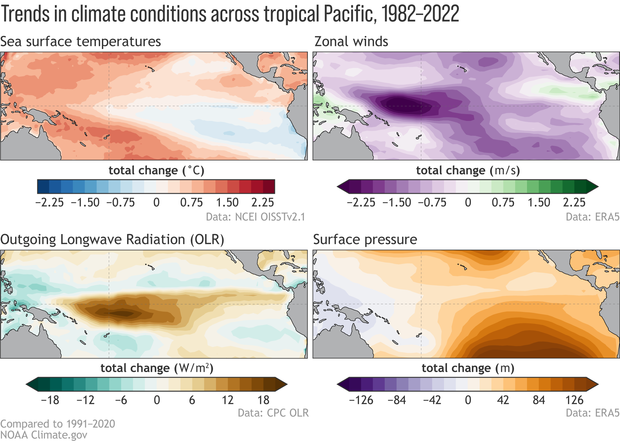
From Jan. 1982 until Dec. 2022, the linear trends of anomalies in sea surface temperature (top left), 850hPa-level zonal winds (top right), outgoing longwave radiation (bottom left), and 1000hPa-level geopotential height (bottom right). Red (blue) shading in the SST map indicates trends toward more positive (negative) SSTs. Purple (green) shading in the wind map indicates that trends are stronger going from east to west (west to east). Brown (green) shading in the OLR map indicates that convection/rainfall is below-average (above-average). Orange (purple) shading in the surface height/pressure map indicates trends toward higher (lower) pressure/heights. Data are in monthly means and the slope is multiplied by the number of months over the period to obtain the total change in the anomalies. Figures by Michelle L’Heureux and modified by climate.gov.
Because what happens in the tropical Pacific doesn’t stay in the tropical Pacific, the difference in the trends between the two sides of the Pacific may also have consequences in far-flung corners of the planet. To examine this possibility, Clara and Stephen decided to make several climate model experiments that isolate the influence of El Niño and the 45-year trend, along with the emissions that humans are putting into the atmosphere (“radiative forcings”). The maps below reveal what their experiments uncovered.
Little butt wiggle
The top row shows the model prediction (footnote #2) for global sea surface temperature (left) and precipitation (right) for the 2023–24 Northern Hemisphere winter (December–February). The intense reds near the equator in the Pacific Ocean in the temperature map is our unmistakable El Niño signal. Likewise, in the precipitation map, green shading over most of the equatorial Pacific reflects above-average precipitation, with brown shading indicating below-average precipitation over the Maritime Continent: a tell-tale sign of El Niño. However, these patterns are not just reflecting El Niño, as the maps the rest of the rows reveal.
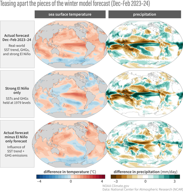
Predicted (left column) Sea surface temperature (SST) anomalies and (right column) precipitation anomalies for December-February 2023-24 from the SMYLE forecast system (see footnotes for details). The top row shows the forecast with all factors included (SST trends, greenhouse gas (GHG) emissions, El Niño), the middle row shows the part of the forecast related to El Niño-only (no SST trend and GHG held at 1979 levels), and the bottom row shows the portion of the forecast attributable to the influence of the SST trend + emissions. In the SST panels, red shading indicates above-average SSTs and blue shading shows below-average SSTs. In the precipitation panels, green shading is above-average precipitation and brown shading indicates below-average precipitation. Anomalies relative to the 1979-2019 average. Figure credit: Adam Phillips, NCAR, with modifications by climate.gov.
The middle row shows the temperature and precipitation forecasts the model would have made for this winter in a hypothetical world with a strong El Niño, but without the sea surface temperature trends or new greenhouse gas emissions that have occurred in the past four decades. In comparing the top and middle rows, what is most striking is the model forecast (top left) does not have cooler sea surface temperatures in the western Pacific (blue shading), which is typical of a strong El Niño. The absence of these cooler temperatures is a red flag that something more than El Niño was behind this winter’s forecast. And you know what happens when a cat sees anything waving. They…
Pounce!
The final row of maps shows the difference between the model forecast (top) and the El Niño-only world (middle). These panels show how the forecast would have looked if the only influence was from sea surface temperature trends and increasing greenhouse gases over the past 40 years, with no contribution at all from El Niño. Now we can clearly see an equatorial pattern that reflects a warmer western Pacific and cooler eastern Pacific. Interestingly, the tropical precipitation anomalies are consistent with those changes, with wetter conditions over the Maritime Continent and drier conditions in the central and eastern Pacific. These anomalies are visually similar to La Niña! (footnote #3)
However, the trend part of these deconstructed forecasts is still weaker compared to the El Niño signal in 2023–24, which is why the top row (including El Niño + trend + emissions) still looks very similar to El Niño overall. Nevertheless, in this forecast attribution, the trend is modifying the 2023–24 El Niño, leading to more warming than expected in the western tropical Pacific and a weaker wetter-than-average area over the equatorial Pacific (compare the top left panel to the “pure” El Niño signal in the left middle). Basically, the El Niño of 2023–24 had trends working against the El Niño pattern!
Did this apply to other areas of the globe? It seems so! Zooming in on the United States, we can see that the top panel (which includes all components of the forecast) is very El Niño-like, as one would expect for the 2023–24 El Niño. However, the trends + emissions part of the forecast (bottom) led to drier conditions along the West Coast and southern tier of the U.S. (also wetter over parts of the northern Rockies and northeastern U.S.). The climate trends were therefore working in opposition to the El Niño-only part of the forecast (middle)! So, the wetter conditions may not have been *as wet* as expected for an El Niño of this strength.
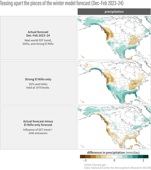
Predicted North America precipitation anomalies for December-February 2023-24 from the SMYLE forecast system (see footnotes for details). The top panel shows the forecast with all factors included (SST trends, greenhouse gas (GHG) emissions, El Niño), the middle panel shows the part of the forecast related to El Niño-only (no SST trend and GHG held at 1979 levels), and the bottom panel shows the portion of the forecast attributable to the influence of the SST trend + emissions. Green shading is above-average precipitation and brown shading indicates below-average precipitation. Anomalies relative to the 1979-2019 average. Figure credit: Adam Phillips, NCAR, with modifications by climate.gov.
Marking their territory
Keep in mind this attribution by Clara and Stephen is applied to forecasts from one particular model. What were the ultimate consequences for the United States in the actual 2023-24 winter observations? Nat dove into this in our blog post last month, showing that the December -February 2023–24 precipitation anomalies were awfully El Niño-like, but there were still deviations from the expected pattern due, in part, to chaotic weather. However, he did subtract out the El Niño pattern from what occurred in winter 2023-24 and got a pattern that looks a lot like the trends that Clara and Stephen have identified (see the drier conditions across the southern tier of the U.S. in the figure below).
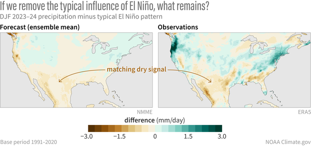
(left) The difference between the North American Multi-Model Ensemble average precipitation forecast for this winter (Dec – Feb 2023-2024) and the pattern of precipitation we'd expect for this past winter based on past El Niño winters from 1952-2022. (right) The difference between the observed precipitation pattern for this past winter and the pattern we’d expect based on past El Niño winters. The matching dry signal over the south-central U.S. and Mexico suggests that these drier conditions may have been predictable more than a season in advance. NOAA Climate.gov image, based on analysis by Nat Johnson.
This is good news because it implies that climate model forecasts may be able to anticipate the trend + El Niño combination to some degree. But the bad news is model predictions seem to have stronger positive sea surface temperature trends in the eastern tropical Pacific than what we’ve been observing over the past 45+ years (footnote #4) and we’re still not totally sure why. Scientists are also unsure what exactly is driving these tropical Pacific trends because, as mentioned above, they tend to oppose the ones projected by climate change simulations. It may be a fluke and could eventually reverse itself, but in the meantime, it will keep a lot of cats occupied, tearing apart their balls of yarn.
Footnotes
(1) Many scientists are interested in attribution of the forecasts and observations. At NOAA CPC, there is also a project that aims to do regular seasonal forecast attribution. Arun Kumar and Mingyue Chen lead that effort and you can find their monthly updates here.
(2) The forecast of December-February sea surface temperatures were produced from the NCAR CESM2/SMYLE coupled climate model system with November 1st initial conditions and with 20 member ensembles. More details on SMYLE are covered in Yeager et al. (2022). To evaluate the atmospheric response to these sea surface temperature predictions, the team ran two separate sets of simulations with 50 ensemble members (using the CAM6 atmospheric model) in which the ocean was always the same but with 50 slightly different atmospheric starting points. In the first set, the ocean state was set to the December-February sea surface temperature predictions and radiative forcings (including greenhouse gases) increased as in the historical record. In the second set, the ocean state was set to the sea surface temperature predictions with the 45-year sea surface temperature subtracted out, and radiative forcings were fixed at 1979 levels. In the jargon of climate scientists, these sorts of experiments with a fixed ocean surface are called “AMIP-type” experiments, and they are the same type of experiments we analyzed in this previous blog post.
(3) It’s important to emphasize while it may look like La Niña, it is not actually La Niña. La Niña is the inverse of El Niño and reflects seasonal-to-interannual mechanisms in the tropical Pacific (see our previous post on the Bjerknes feedback). While the tropical Pacific climate trend might have some La Niña-like qualities to it, it arises from other factors independent of ENSO.
(4) Positive trend errors in climate forecast models have been documented in several papers (this and this) and another talk on this topic was recently given by NOAA/CIRES’ scientist, Jon Beverley, at a recent workshop.
Comments
No mention of the
PDO being NEGATIVE since the past El Nino that ended in 2016. I would think that would effect the precipitation patterns over the CONUS ? Great article and very informative, but there is NO proof that the warming of the oceans is going to be permanent as the Earth goes forward in time. It's just a long weather cycle to we Humans, but not to the Earth.
Fake information
Your blog is really good and informative. And, it is really nice to be able to ask questions, and to get informative answers.
That said, I have noticed that, from time to time, people will post misinformation (or even disinformation) about human-caused global warming (such as claiming that it is caused by solar flares, that there is no proof of it, or that it is a temporary phenomenon, among other things). It is frankly annoying reading posts like that, plus I have noticed (from experience) that taking the time to debunk that kind of fake information accomplishes nothing.
As well, I suspect that the same would be true if I were to ask questions, such as what evidence backs up their assertions, or where they got their information.
So, I have a request: When you make posts, include a notice about how responses with misinformation or disinformation about climate will not be published. And, keep to it.
Thanks for reading this, and I look forward to hearing from you.
EL Nino Winter-Spring 2024
People do live in New Mexico, though we have a saying: one of our fifty is missing - because the rest of the US does not know we exist. Neither did this past weather phenomenon. From what I can gather from your cat analogy (really?) and way too scientific briefing (oxymoron) and what of my biggest dislikes of Science (Too technical and lack of brief explanation) , is that the SST WAS NOT INCLUDED IN YOUR FORECAST and therefore we had a wacky time with more moisture in the air that dumped California and headed away from the south instead of heading towards the south. I gather as the sea temps keep rising are we stuck in an El niño pattern? And that leaves Arizona, esp NM and parts of West Texas without any rain. We then hope and pray for summer monsoon. Which brings lightening strikes,It’s all convoluted but I would live a straight answer why NM especially had the driest El Niño on record.
Dry El Niño for NM
Sorry that you didn't feel this post hit the right balance between too much versus not enough detail!
The straightest answer I can give you for why NM had "the driest El Niño on record" is that...it didn't.
New Mexico and many parts of the southern tier of the US did see the typical El Niño impact of a wetter-than-average winter. In terms of ranks, it was not the wettest El Niño winter for NM, but it also wasn't the driest. I didn't have to look very far back in the history to find out that the winter of 2018-19 (also an El Niño winter; you can find the list of historical episodes here) was drier than this past winter.
Now, as far as a brief summary of what this post is about, this is how I would put it:
Hope this helps!
Comments have been disabled on this article