Earlier this year we wrote about how weather affected the arrival of spring’s first leaves across the United States. Next, we wrote about another important sign of spring—first bloom dates—and where the first blooms of lilacs and honeysuckles were and weren’t in sync with this year’s leaf-out dates. For the last post in this series we are going to explore how these important milestones of nature’s calendar have been shifting in recent years. These spring indicators are provided by the U.S. National Phenology Network, which monitors seasonal activity in nearly 2,000 species of plants and animals across the country.
First leaf dates largely arrive early, except in one region
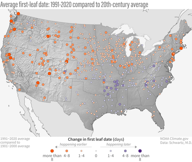
First leaf date in 1991-2020 compared to the 20th-century average (1901-2000). Orange shows places where the first leaf of lilacs and honeysuckles emerged earlier than the long-term average; purple shows places where leaves were later than the long-term average. NOAA Climate.gov map, based on analysis by Mark D. Schwartz, University of Wisconsin-Milwaukee.
The map above compares the average leaf-out date for the most recent 30-year climate normals (1991-2020) to the 20th-century average (1901-2000) for more than 500 stations across the contiguous United States. Orange shows locations where the first leaves emerged earlier in recent decades than they did in the 20th century. Purple shows locations where leaves emerged later. The bigger the circle, the bigger the difference from average (also known as an anomaly).
There is a fairly consistent pattern across the West, the Plains, the Great Lakes, and the Northeast. All of these areas experienced earlier leaf-out dates compared to the 20th-century average. Some of the largest anomalies are located across areas of the western United States. However, one region doesn’t match this early leaf-out pattern: the Southeast. Purple dots scattered from the Gulf Coast states northward as far as West Virginia show where the opposite is happening, meaning spring leaf-out has been occurring later in recent decades than it did in the 20th century on average.
First bloom dates are a little more mixed
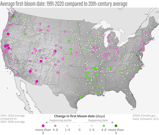
Average first-bloom date from 1991-2020 compared to the 20th-century average (1901-2000). Pink shows places where the first bloom of lilacs and honeysuckle emerged earlier than the long-term average; green shows places where blooms were later than the long-term average. NOAA Climate.gov map, based on analysis by Mark D. Schwartz, University of Wisconsin-Milwaukee.
We also created a map for first blooms. The map above compares the average first bloom date for the most recent 30-year climate normals period (1991-2020) to the 20th-century average (1901-2000) for more than 500 stations across the contiguous United States. Pink shows stations where the first blooms of lilacs and honeysuckles emerged earlier on average in recent decades than they did in the 20th century. Green shows stations where first blooms emerged later. The bigger the circle, the bigger the difference from average.
The dominant pattern on the first-bloom map is similar in many ways to the first-leaf map: earlier blooms in much of the West, portions of the Great Lakes, and the Northeast, coupled with later blooms in the Southeast. However, there are locations where the patterns are more mixed, especially across areas of the central United States, the Midwest, and the Northern Rockies, where plenty of green dots (later-than-average first blooms) can be seen. Areas of early blooms are most prevalent across portions of the West, while areas of later blooms are more prevalent across the Southeast.
Changes in nature’s calendar linked to changes in temperature
Scientists have high to very high confidence that earlier spring events, like first leaf, are directly linked to warming temperatures, especially across North America according to the Intergovernmental Panel on Climate Change’s (IPCC) Sixth Assessment Report. A map of spring temperature trends from (1896-2020) shows parts of the country with the largest rates of warming—the West, the Upper Midwest, and the Northeast. These areas match where leaf-out dates are coming earlier.
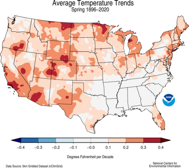
Average temperatures trend for spring (March-May) from 1896-2020. This map shows how spring temperatures have changed across the contiguous United States. Orange to red show where temperatures have warmed, and gray shows where temperature changes have been close to zero. Map from NOAA’s National Centers for Environmental Information.
The temperature trend map also provides a possible explanation for the later emergence of leaves across a large portion of the Southeast. Compared to the rest of the country, the Southeast has what scientists have nicknamed a “warming hole”—an area where temperatures are warming much more slowly or even, in some places and seasons, cooling.
Scientists have developed several hypotheses to explain the Southeast warming hole, however no single explanation has been universally accepted. One leading theory is that changes in natural climate patterns over the Pacific and Atlantic Oceans may be offsetting the long-term warming influence of increasing greenhouse gases. These include the Pacific Decadal Oscillation and the North Atlantic Oscillation, both of which impact the jet stream over the eastern United States and subsequent weather patterns like cold air outbreaks and heat domes. (You can read more about the Southeast U.S. warming hole here).
In recent years this “warming hole” has begun to fill in. The maps below show average temperature for each 30-year U.S. Climate Normals period since 1901 compared to the 20th-century average. Temperatures across the Southeast were warmer than average through the 1931 to 1960 normals, and then showed a cooling trend up through the 1990s. This cooling signal began to weaken in the 1971 to 2000 normals, and in the most recent normals this cooler-than-average signal is gone altogether.
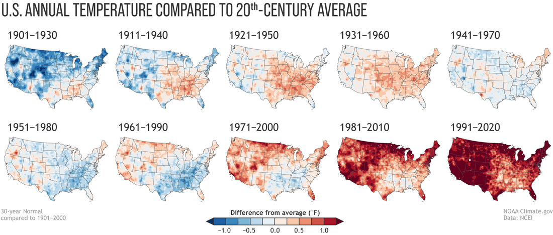
Annual U.S. temperature compared to the 20th-century average for each U.S. Climate Normals period from 1901-1930 (upper left) to 1991-2020 (lower right). Places where the normal annual temperature was 1.25 degrees or more colder than the 20th-century average are darkest blue; places where normal annual temperature was 1.25 degrees or more warmer than the 20th-century average are darkest red. Maps by NOAA Climate.gov, based on analysis by Jared Rennie, North Carolina Institute for Climate Studies/NCEI.
We spoke with Mark D. Schwartz, a leading expert in Phenoclimatology, about these patterns. Regarding the first-leaf trends in the Southeast, Schwartz said there have been episodic changes over the last century. If you take a look at the graph below you can visualize these changes (in purple).
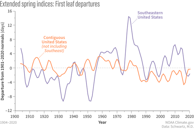
Smoothed Spring Leaf Index departures from the 20th-century average for the Southeastern United States in purple and the rest of the lower-48 states in orange from 1904–2020. Graph by NOAA Climate.gov, based on analysis by Mark D. Schwartz, University of Wisconsin-Milwaukee
From 1900 through the 1950s, leaf-out dates were generally much earlier than the 20th-century average. Then the pattern swung dramatically in the other direction, with later-than-average leaf-out dates through most of the past 50 years. Across the rest of the United States (red line), the trend had been relatively flat until the mid-80s. Then, the Spring Leaf Index jumped to dates that were earlier than average by about 3 to 4 days. In the last 5 to 10 years, first-leaf dates in the Southeast have come more into sync with the rest of the United States—both have been earlier than average. Schwartz did note that there could be “something interesting going on in the last few years,” but we won’t know if that is “dust in the record,” as he called it, or more of a large-scale “regime change”—meaning the Southeast starting to exhibit changes that we’d expect due to global warming. Time will tell.
Both cold snaps and late winter/early spring heat waves have an impact on the First Leaf Index on a year-to-year basis. For this specific dataset, which is based on cloned (genetically identical) lilacs and honeysuckles, these plants leaf first then bloom. Spring bloom dates typically occur in late spring or early summer. Large-scale weather events, like major cold snaps or heat waves, tend to diminish as the spring season progresses, making “later season events” like first blooms more of a messy signal, especially when correlated with overall warming of seasonal temperatures. Schwartz said that the trends being stronger and more geographically consistent for the first leaf index than the first bloom index are in line with these varying weather events year-to-year. Still, generally speaking, first leaf events and first blooms are highly correlated, hence why in many locations on these maps they are in sync: both early or both late.
Regardless of year-to-year variations in weather conditions, both of these spring indicators are useful in tracking how plant life cycles are being impacted in the short- and long-term. The Spring Indices have been adopted as a climate change indicator by both the U.S. Environmental Protection Agency (Environmental Protection Agency, 2023) and the U.S. Global Change Research Program (U.S. Global Change Research Program, 2024) because of their utility in reflecting the timing of springtime activity across large regions, Schwartz wrote in this recent paper. In 2007, the IPCC stated that phenology “is perhaps the simplest process in which to track changes in the ecology of species in response to climate change.”