How good have models been at predicting ENSO in the 21st century?
In the, roughly, 250 years of the ENSO Blog and our 3.4 million posts, we’ve discussed ad nauseum how complicated El Niño and La Niña are, and how difficult it is to forecast all of the ENSO nuances. Heck, I even wrote a three-part series 75 years ago that evaluated all of our seasonal forecasts (ok, it was 2014-2015 but it still feels that long ago). In a new paper, Azhar Ehsan, friend of the blog and a member of NOAA’s ENSO forecast team, and colleagues analyzed over 20 years’ worth of climate model forecasts of ENSO and found some interesting results.
Why is this paper unique? Well, most seasonal forecasting evaluations focus on model hindcasts, which are forecasts run using past observational data as the start (or initial) condition. For example, if the models are provided the initial conditions on July 1st, 1983, what forecast would it have made? The nice thing about running on past data is that you already know what occurred and can immediately see how well the forecast did. The downside is that sometimes the model development itself can be influenced by this past data. The purest test for models is how well they do in the future, on data that the model has never ever seen. This type of evaluation on “real-time forecasts” is much rarer, and is exactly what Azhar and his co-authors did.
ENSO Terms and conditions
La Niña and El Niño make up the El Niño/Southern Oscillation, or ENSO. La Niña is characterized by cooler-than-average sea surface temperatures across the central and eastern tropical Pacific Ocean. El Niño is the opposite phase, with warmer-than-average water present across the tropical Pacific Ocean. These changes in sea surface temperature across the Pacific jumble up the atmosphere above which can lead to global impacts on climate patterns. Seems pretty important, right? And unlike most other climate phenomena, the state of ENSO can be forecast months in advance, giving communities time to prepare.
Tell me about that sweet, sweet data
Let me paint you a picture. It’s February 2002. Crossroads starring Britney Spears has just come out, while Ja Rule and Nickelback are burning up the music charts. At Columbia University’s International Research Institute for Climate and Society (IRI), a plucky group of scientists has begun issuing ENSO forecasts. That effort has now become the world’s longest archive of real-time monthly ENSO forecasts from modeling groups across the globe. The list of forecast contributors has continued to grow since 2002, and the tally of the treasure trove of climate model data currently stands at 28 different climate models.
Why so many? No single model forecast is ever going to be exactly correct all the time. To get a sense of the range of potential outcomes, it’s important to not only have a bunch of forecasts using the same climate model due to the chaos of climate but also forecasts from a bunch of different models due to the idiosyncrasies of each individual (we call these combined bunches multi-model ensembles). A well-constructed forecast ensemble won’t tell you precisely what outcome to expect, but it will tell you how much the odds are tilted toward one outcome or the other (i.e., probabilities).
The model forecasts can be split into two types, dynamical and statistical. Dynamical models refer to models which take observational data to simulate earth’s future climate by using equations that represent our best understanding of the laws of physics (e.g., like the computer climate models that make up the North American Multi-Model Ensemble, or NMME, that are frequently featured in this blog). Statistical models, on the other hand, use the historical relationships between ENSO and other climate variables from the observational record and then use these relationships to make predictions for the current situation.
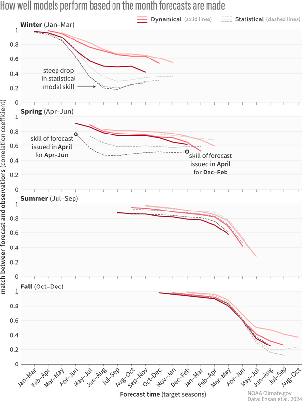
A stacked graph showing the correlation coefficient, or the match between the forecast and observations, of climate model forecasts for nine consecutive three-month periods starting from the month the forecast was issued. One means a perfect match, and zero is the complete opposite. Red lines refer to dynamical models while black dotted lines are statistical models. Each of the four graphs represents forecasts made during months in different seasons. The darkness of the line represents which month the forecast is from, with the darkest lines being the last month in the marked season. In winter, statistical model skill falls rapidly by the spring, while dynamical models don't exhibit nearly as much decline in skill. Forecasts made in spring and summer show similar skill between statistical and dynamical models. Climate.gov image adapted from Ehsan et al., 2024.
How did the models do?
By analyzing all model forecasts of the seasonal (three-month) Niño-3.4 index from 2002 through 2023, Azhar and his co-authors discovered some interesting patterns. First, it was clear that there was a decent amount of variation in how well both the dynamical and statistical models performed given both when the forecast was made and what season was targeted. From past ENSO blog posts (here, here, and here), we know that the model skill for forecasts made during the spring predictability barrier—a time where models do particularly poorly in forecasting the fall/winter state of ENSO—is not great. But even then, the skill of statistical model forecasts issued just before and during the spring fell off a cliff for target months in early summer and beyond, much more so than dynamical models. However, the skill of statistical and dynamical model forecasts issued in summer and fall were comparable for all times in the future.
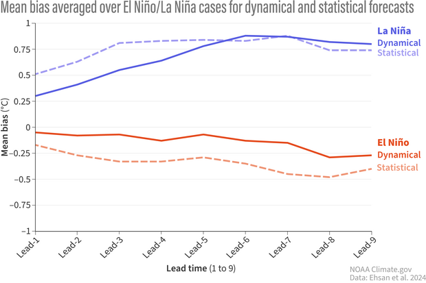
The mean bias of climate model forecasts averaged over El Nino (red) and La Nina (blue) events for each lead time, which refers to the three-month period forecasted. Solid lines are dynamical model forecasts, and dotted lines are statistical models. Overall, models have less bias when predicting El Nino than La Nina. And dynamical models have less bias in general compared to statistical models. Climate.gov image adapted from Ehsan et al., 2024.
Second, there were differences in model performance for predicting El Niño versus predicting La Niña. Overall, models had greater skill in predicting El Niño, compared to La Niña, no matter when the forecast was made, whether it was one month or nine months prior. Dynamical models also outperformed the statistical models in forecasting El Niño at all lead times, and for La Niña for short time horizons. For forecasts of La Niña made five or more seasons out, both statistical and dynamical models performed comparably (and not very well).
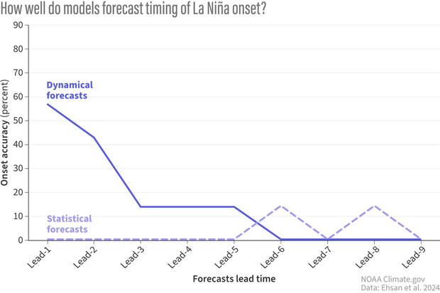
How often (percent) real-time climate model forecasts correctly predict the onset of El Nino (3-month average Nino3.4 values less than or equal to -0.5C) at increasingly far-off lead times. Solid lines represent the multi-model mean of dynamical models. Dotted lines are the multi-model mean of the statistical models. After the first three forecasted seasons, accuracy plummets below 20% in dynamical models. Statistical model accuracy is 0 for most leads except leads 6 and 8. This does not imply that statistical models have more "skill" at these leads as, given the variability in ENSO events and in model forecasts, it is probabilistically likely that models will occasionally correctly predict the onset by chance. Climate.gov image adapted from Ehsan et al., 2024.
Can someone tell me when this El Niño or La Niña turns on?
It’s one thing to predict the strength of an El Niño or La Niña event when its already at its peak and mature, and quite another challenge to correctly predict when an event begins. And one rather interesting finding falls right in line with what we’ve observed so far during the current La Niña.
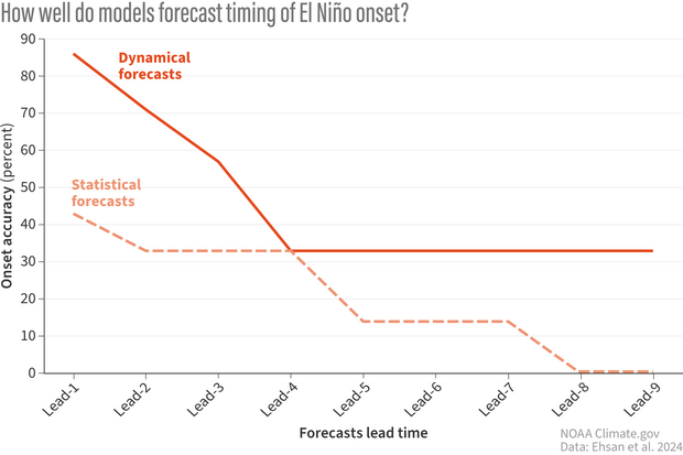
How often (percent) real-time climate model forecasts correctly predict the onset of El Nino (3-month average Nino3.4 values greater than or equal to 0.5C) at increasingly far-off lead times. Solid lines are the multi-model mean of dynamical model forecasts. Dotted lines are the multi-model mean of statistical model forecasts. Dynamical models have excellent accuracy at predicting the onset through the first three seasonal lead times before dropping to 30-40% accuracy from lead-4 onwards. Statistical models show less accuracy overall. Climate.gov image adapted from Ehsan et al., 2024.
Azhar and his team found that dynamical models are excellent at predicting the start of El Niño events up to a three-month lead (they are accurate more than ~60% of the time). But for La Niña, yikes. Dynamical models are ok for onset predictions two seasons in the future (40-60% accurate), but after that the accuracy drops to 20% and then to 0 (Footnote 1). Meanwhile, the less I say about statistical models predicting the onset of El Niño and La Niña, the better. Suffice to say, they’re not great.
Remember this analysis did not include 2024. So, the incredibly delayed start to the current La Niña, one that many models missed, was not in this analysis.
Caveats
When it comes to science, usually it’s easier to find the patterns then to determine exactly why those patterns exist. Azhar and his fellow authors shared some potential explanations but solid conclusions will need additional research.
Why is there a difference in skill between dynamical and statistical models? Dynamical models have seen a rapid evolution from 2002 to now. Advancements in computer resources, better observations, and a more complete understanding of our atmosphere and ocean have not just improved existing models but have led to an increase in the number of dynamical models over time. The number of statistical models has remained roughly the same. Though, over the last couple of years, the numbers have been increasing (Footnote 2).
So, why bother including statistical models? For one, statistical models serve as a valuable benchmark to measure more complicated models against. Two, they are much cheaper and thus faster to run. And three, unlike dynamical models where the factors that are driving a certain ENSO forecast may be too mixed together and unclear, statistical models with their simplicity can sometimes allow forecasters to unpack what factors are driving the forecast.
Of course, one major caveat here is that this analysis only looks at a small amount of ENSO events. Nevertheless, some conclusions are clear. Predicting the onset of an El Niño and La Niña event is hard. To which THIS ENSO forecaster (me) says “Tell me about it!”
Footnotes
1) Accuracy here is defined as the ratio of correctly forecasted ENSO onset times to the number of total episodes. A forecast is a “hit” if the forecasted Niño-3.4 index meets or exceeds the threshold for El Niño (+0.5°C) or La Niña events (-0.5°C) at the event onset. A 0% accuracy for a given lead time means that no model correctly forecast the onset of the event at that lead time.
2) There are new types of promising statistical models popping up that incorporate artificial intelligence and machine learning which have been added into the plume. Model evolution is not strictly the domain of dynamical models! Hopefully, additional statistical models can be incorporated into the IRI plume to potentially offer better real-time ENSO forecasts.
Comments
75 ago
Tom, you must have been a child prodigy 75 years ago😉
Thanks for the article
cheers👍
Downsizing!!!!
Tom, just saw your story with CBS that your job was terminated today. So sorry to see this happen. You have been a shining example for NOAA. Wish you the best!
Arctic Sea Ice
Here in California we consider the snow accumulation in the Sierras to be over by April first. The end of March also signals the end of Arctic Sea ice accumulation. This year is shaping up to be a record low of the maximum sea ice extent. I find this interesting because the four lowest(I think, just looking at the Charctic graph) on record occurred from 2015-2018. Causation or correlation but that more or less lines up with the NE Pacific marine heat wave. I think it would be interesting if this Spring the typical NW winds that create all the upwelling in CA fail to materialize and if that blob pops back up..... I know, lots of chickens vs. eggs in that statement but let me just say I'm not buying a new wetsuit this May.
Well-written
Excellent article, Tom! Thank you
Comments have been disabled on this article